Across the world, Apple users are waking up to a new font on their favourite devices. In the interview that follows, Walrus editor-in-chief Jonathan Kay and art director Brian Morgan talk about how the move changes the look of one of our time’s signature technology brands, and how San Francisco—meant to become the system font on everything from the iPhone to the Apple Watch to the MacBook—figures in the grand sweep of digital typography.
Jonathan Kay: I see you’ve loaded up iOS 9 on your phone. For me it took a few minutes to realize the typeface had changed with the new Apple update. How long did it take you?
Brian Morgan: It didn’t take very long because people in my field have been talking about this since November last year. This was a big deal in developers’ circles. People have been making noise about it. It was like, Oh, no, they’re getting rid of Helvetica! But there also had been tantalizing hints about what the San Francisco font would look like.
JK: Now that it’s arrived, what do people think?
BM: I think people like it. I don’t think anyone is selling the family farm to buy it, but people have received it well. There are a few minor reactionary elements who feel that since Helvetica is Helvetica, they shouldn’t have abandoned it. But Helvetica itself wasn’t well received when Apple put it in iOS 7.
JK: There are thousands of typefaces out there. What is it that leads an industrial designer to determine that there needs to be a whole new typeface created from scratch?
BM: For one, there is a licensing concern: to license a new typeface for an operating system can cost hundreds of thousands of dollars, because of intellectual property rights.
JK: So were the owners of Helvetica getting paid every time an iPhone was produced?
BM: I don’t know the details, but they probably got a negotiated package. Flat rate. It actually makes sense to make your own. And it’s like making your own house: you can put the kitchen where you want it. You can have nine bathrooms.
JK: How many people do you think worked on the creation of this typeface?
BM: I don’t know for sure, but from other typeface projects I’m familiar with, small groups work on these things—probably five people. Maybe more because of product testing. Apple is not exactly known for sharing its secrets.
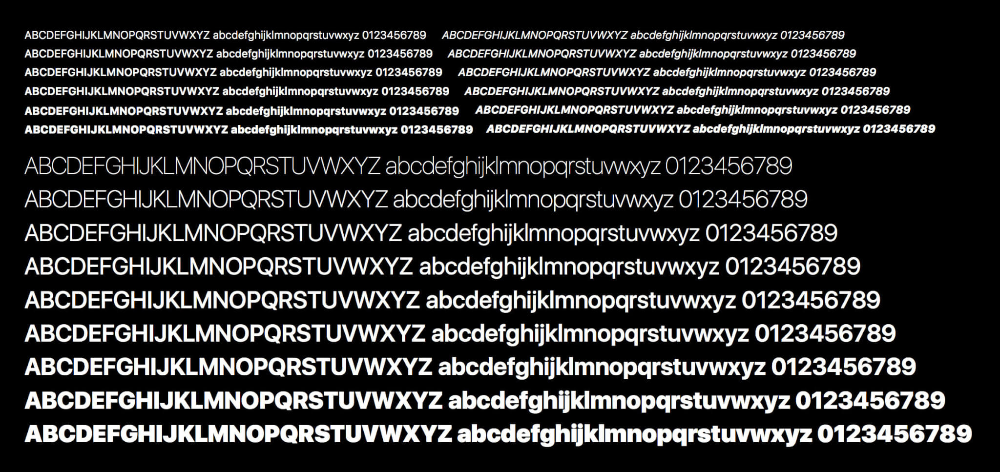
JK: I’m guessing you don’t just have to do one version of the typeface. You also have to do the italicized version of it, the bold version, and so forth.
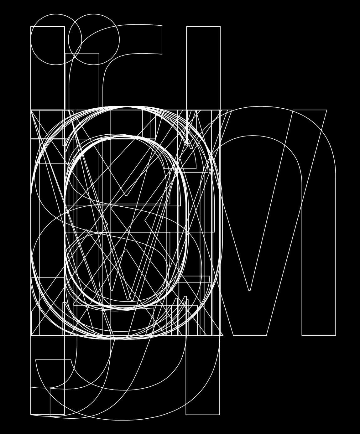
BM: Oh, yeah. And there’s all sorts of stuff underneath the hood, too. When you do a typeface, you draw the typeface; that’s the obvious thing. You make the letters in a certain shape. But then you check things like their side bearings. If you type a character—O, say—with no side bearings, and then you type another O, they could touch.
JK: So side bearings, for those who don’t know the language, that’s essentially the buffer spaces between the letters.
BM: Exactly. So you do the buffer space, then test to make sure the characters fit together well. Then you do a kerning table. The kerning table includes exceptions; for instance, if you didn’t have a kerning table, the uppercase T and the lowercase o would be quite far apart from each other.
JK: So you’re talking about how different characters operate together when they are adjacent, in the same way that a pharmacist has to know how drugs interact together in the human body.
BM: Yeah. It’s less sophisticated than pharmacology, but there is a large table of exceptions to the metrics, and there are sub-tables beyond those. And that’s actually where San Francisco gets interesting, because it’s legible and good looking—even if it’s not the most beautiful typeface in the world. Because they have brought modern typographical functionalities, things that have generally been available only to designers, into the operating system. For example, if you type in a fraction, and it’s a weird fraction, it’ll be made on the fly.
JK: So something like 3/7 could be made on the fly?
BM: It also could be made on the fly with lookup tables. OpenType can do this, but operating systems never took advantage of these features.
JK: When I’m on Microsoft Word, I have my choice of hundreds of typefaces. How come I have only one typeface on the most sophisticated smartphone in the world?
BM: You have the choice of one typeface because that typeface is doing a lot. It’s also so there is consistency across the entire system. It’s very legible at small sizes. Like Verdana, it’s been built for screens. They made a version just for the Apple Watch. They have display sizes and a text size for the watch and for their operating systems, and they’ve also done some interesting things, like with 6 and 9, there are alternate versions of those characters so that in certain situations they won’t be confused with an 8. It’s an issue of branding, too. With one typeface, the Mac looks even more Mac-like inside the OS.
JK: What was your reaction when you first saw San Francisco on your iPhone?
BM: I kind of liked it. I thought it was a nice change from Helvetica. I like Helvetica, but I’m not a huge fan of it. It also wasn’t digitized all that well, although Christian Schwartz recently made an excellent version from the originals. It can also have legibility issues onscreen.
JK: People ask this question about every art or quasi-art: Will there come a time when we will say, “We have enough typefaces, we’ve done every possible configuration, we’re done”?
BM: No, no. Typefaces are like plays in that way. No one is going to stop performing or writing new plays.
JK: Yet Arial and Times New Roman are like the Gilbert and Sullivan of the theatrical world. Everyone likes the classics.
BM: Even so, people will always cook up new typefaces. Obviously you need the thing to display on different devices, and it needs to have a certain software footprint. But there’s also the element of style.
JK: Speaking of style, an album comes out and critics ask, Will we be listening to this in twenty years? Well, let me adapt the question: Will we know what the San Francisco typeface is in twenty years? Will it enter the pantheon of the big, well-known typefaces?
BM: I think it’s well designed, though not original enough to be remembered forever. But it’s a workhorse typeface. It might get used a lot outside the OS.
JK: I know you have favourite typefaces for reading and favourite typefaces for writing. Do you believe typeface selection influences the way you create or read words?
BM: Yes. There was an interesting piece that Errol Morris did a few years ago for the New York Times website. People were given a survey, and the typeface used varied randomly from one participant to the next. It turned out that answers varied depending on the typeface in which the survey was set.
JK: So what does San Francisco communicate about the way Apple wants its devices to be used? What’s the message?
BM: I think the message is functionality. It’s also a product of now; there’s a contemporary feel to it.
JK: We can look at a historical photo of a street scene and identify the era in which it was taken based on the clothes the subjects are wearing. In fifty or 100 years, will people be able to look back at San Francisco and know that it’s an early twenty-first-century typeface?
BM: Yeah, probably. We’re in a moment right now when a lot of people are exploring what’s possible with the geometric sans, which you see in Google’s new logo, but it’s not always a good class of text typeface. Quite sensibly, Apple has taken a couple of hints from this trend—but mostly this is a really solid working typeface, like FF Din or Neutral.
JK: Are we in the era of sans serif forevermore?
BM: No, we’ll just be adding options as we go on.
JK: When you see someone using a serif font, what’s the message? Is it steampunk?
BM: There’s more to it than steampunk. A serif font, one that has “feet” or serifs at the ends of the vertical parts of the characters, has a lot of potential for distinctiveness and character. Imagine female opera singers. You can’t just say, That’s an opera singer. I mean, there’s soprano, mezzo, contralto—all sorts of possibilities. And what they sing will depend their voice and their approach. Just as every typeface has a discernible voice.
JK: But the sans serif denies you that grace note at the end of every character.
BM: Not really. There’s less variation in a sans serif than in a serif simply because of the limitations of drawing them, but no, there are infinite possibilities for drawing and rendering and kerning and putting it all together. It’s like weaving cloth. People are still cooking up interesting and new ways of weaving cloth. We’ve been doing it for thousands of years. Issey Miyake has programmable looms. People are bringing back Liberty prints. People are doing all sorts of things with cloth.
JK: Obviously San Francisco is different from the typeface that appears in The Walrus. But given that this is a big moment in typeface design, is it something you’ll keep in mind when, several years from now, you’re remaking the magazine? Is it something you have to consider—that this is where the culture is going? Or do you say, Well, that’s nice for gadgets, but I’m designing a magazine.
BM: I think San Francisco is nice for what it is, but I’ll design my magazine in a different way. One arm of our project is in print, and the demands there aren’t the same. San Francisco’s a very nice, functional typeface. But if you take it on entirely, then you start looking like Apple. People design typefaces partly as a branding exercise. It’s subtle but extremely effective.
JK: So we are talking about millions and millions of products, suffused with Appleness.
BM: Very light Appleness.
This interview has been edited and condensed.