These three rhythmic paintings of repeated brush patterns in gouache and watercolour markings, by Vancouver artist Eli Bornowsky, were commissioned by The Walrus for an ongoing special folio of new works by contemporary Canadian artists. Bornowsky’s paintings form the third collection, and a fourth will appear in these pages later this year. This affords us the opportunity to reverse the typical magazine arrangement where an artist contributes spot illustrations to be framed within the context of a piece of journalism. Consider this essay a “spot text” bordered by Bornowsky’s artwork.
His paintings are full of such reversals; the action takes place along the illuminated borders. A frame is supposed to fix your attention on the art inside. But in Bornowsky’s paintings the edges are impulsive, pulling your eye away from what is normally the main event. The central images are, by contrast, more subtle.
Bornowsky is among a group of artists in Vancouver whose pictures have helped restore the city’s interest in the possibilities of abstract painting. Born in 1980, he moved to the city from Alberta to study art, and his first mentor in hard-edged free-form abstraction was Eric Metcalfe, co-founder of the East Van artist-run space the Western Front. At Emily Carr University, Bornowsky studied with the neo-optical artist Neil Campbell, whose work applies post-structuralist theory to large-scale retinal experiments. Then, in the mid-2000s, Elizabeth McIntosh moved to town. She is well known for hard-edged geo-mosaics in dusty, melodic palettes that contemplate you as much as you contemplate them. By this time, Bornowsky was painting vivid, six-dimensional colour grids, virtual objects floating on white gesso. In his spare time, he viewed exhibits of the frameless avant-garde comic pages of Marc Bell and, perhaps most significant, work by the American master of tiny Zen assemblages, Richard Tuttle.
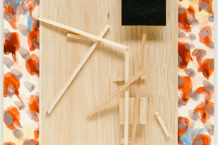
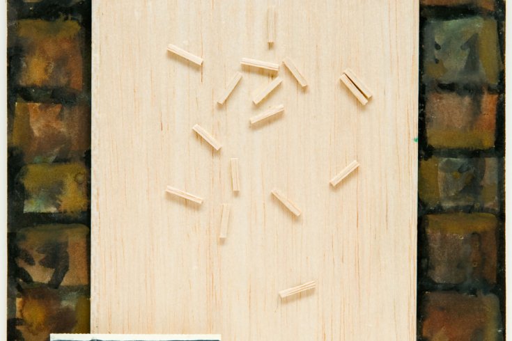
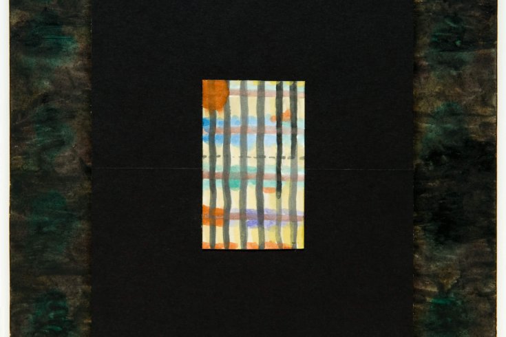
Of the three images presented here, the first has the darkest, biggest borders, with a small, bright gingham-patterned painting floating at the centre. As the sequence continues, dawn breaks over the frames, and they reverse from night black into a hazel dusk light, and eventually into a sunny floral shade. Meanwhile, the interior paintings become darker in phases as they rotate around the centre.
Perhaps these interior paintings, these rectangular thought bubbles, are the actual art. Imprisoned by multiple frames into corners, like postage stamps, the littlest image is a hostage to the balsa pieces at the centre. The wood grows from a flat, dark surface in the first to a pale, deserted sketch in the last, a sketch made of pencils but not of lead. These balsa forms could be another frame, stripped off the edges, oscillating and strewn across the picture plane. They act painterly and three-dimensional, and yet somehow still flat. There’s something slow moving about the balsa wood, whereas the borders seem to be finished in a single, continuous frenzy.
Bornowsky looks for an oscillation of value among the components in his work. Like siblings dividing to conquer, elements compete to dominate the viewer’s attention. This foreground-background shift starts around the border, then continues as our attention drifts over the semi-deserted balsa landscapes, where the little rectangular abstract paintings pop up just before the eye returns to bounce around the frame some more.
For this assignment, Bornowsky dramatically scaled his work down to something close to a Tuttle-inspired size. Each painting is the same size as the page it is reproduced on. Like time, scale is relative. Within the scale of the magazine, these small pieces are potentially huge, disorienting our sense of proportion. Reproduction implies its own grandeur. A magazine rarely reprints pictures to scale, and so the ambiguity inherent in this presentation complicates our understanding of Bornowsky’s page-size paintings.
Scale is Eli Bornowsky’s replacement of vista. Each of the small interior watercolours is the size of a notecard. These pictures are deep within the whole picture, like the billboard in a street view seen through a hotel window. Symmetrically speaking, I’m certain an exact number of these small interior paintings could fit in every Walrus-sized frame, a touch of sacred geometry. The question of how to frame a context, of what stays in and what gets removed, is of concern to artists and curators alike, as well as to writers and magazine mastheads—to anyone with a voice. The frame becomes the audience.
This appeared in the June 2011 issue.