For more than a decade, the American paint manufacturer Benjamin Moore has selected a “colour of the year” in an attempt to capture the spirit of what’s trending in interior design. Take a look back at the last few winners and you’ll see some similarities: 2022’s “October Mist” is a quietly minty green; “First Light,” from 2020, is beige with the faintest hint of blush pink; and 2019’s “Metropolitan” is essentially a glorified grey. Each one looks diluted: the ghost of a formerly vibrant shade tossed into colour jail and forced to wear an ugly, muted uniform.
Yet, compared to the paint colours people are actually buying, the annual winners seem bold and adventurous. In the US, “Classic Gray,” “Pale Oak,” and “Swiss Coffee”—all shades of off-white, barely distinguishable from one another—made Benjamin Moore’s bestseller list. Those north of the border, according to an HGTV list titled “The 10 Most Popular Paint Colours in Canada Might Surprise You,” enjoy “White Dove” and “Chantilly Lace” (both are, perhaps unsurprisingly, fancy ways of saying “plain white”).
The result isn’t just interiors that feel devoid of personality but also ones that look entirely the same—decorated with flat greige accents and matching white Ikea furniture. In a 2016 article for The Verge, Kyle Chayka wrote about how Silicon Valley has helped spread that cut-and-paste aesthetic around the world. With technology touching each space we visit—restaurant recommendations on Foursquare, accommodation bookings through Airbnb—our interiors have had no choice but to morph into one another. “The interchangeability, ceaseless movement, and symbolic blankness that was once the hallmark of hotels and airports . . . has leaked into the rest of life,” Chayka wrote. “If taste is globalized, then the logical endpoint is a world in which aesthetic diversity decreases.”
That endpoint is peak neutral. And now that we’ve arrived, surely, we’re due for a change.
While colour is personal and often seen as a way to express ourselves, it also comes with a pretty thick rule book. Colour theory dictates which hues are compatible and which ones clash. Certain colours can make us feel energized, or focused, or sad, which is why you would be ill-advised to paint your bedroom an aggressive red or your kitchen bright yellow. Neutrals, by contrast, have earned a reputation as being safe—shades that are inoffensive and appeal to the masses.
Just scroll through condo listings in London, New York, or Toronto. They all look like showrooms ripped from the same design magazine, doomed to stay white to appease a constant turnover of tenants. That same sentiment applies to homeowners. While our homes are meant to be extensions of ourselves, as Amanda Mull, a staff writer at The Atlantic, told Marketplace, they’re also financialized. Those who plan to sell—even if it’s years down the road—are often more inclined to make design choices based on what other people seem to like. Real estate agents claim that homes painted in neutrals tend to sell more quickly than those with bold colours, and, according to a 2021 survey by Zillow and Behr Paint Co., they also sell for slightly more money. White walls are a blank canvas meant to communicate “anyone could live here.” Royal purple? Not so much.
Born and raised in Venezuela, Montaha Hidefi, a Guelph-based “colour archeologist” and colour-trend forecaster, notes that this is more of a Western phenomenon. Countries closer to the equator—especially parts of West Africa and South America—tend to have a different relationship with colour because of the sun: there’s more of it, which makes everything brighter and greener. By contrast, colder countries spend half the year in darkness, so they gravitate toward more sombre colours—which might help explain Scandinavia’s signature brand of space-grey minimalism. “Our preferences are influenced by our environment. A lot of people have a fear of colour because they don’t know how to react to it,” Hidefi says. “Perhaps the safest colour is no colour.”
But our preferences can just as easily be influenced by what’s going on around us, and Hidefi adds that each decade has a certain “visual flavour.” Amid the space race and the Cold War, the explosion of mustard yellow, blazing orange, and pimento olive green in the ’60s came to represent free love, self-expression, and the emergence of psychedelic rock. Then, in the midst of the Vietnam War, the ’70s saw a shift toward earthy tones that reflected a desire for calm and peace. But all those warm, fun colours seem to fade as we inch closer to the 2000s.
The turn of the millennium brought with it a new set of circumstances and challenges. The advancement of technology meant that companies were adopting silver metallics into their designs. Phones, once produced in shades of candy red and Barbie pink, morphed into silver aluminum bricks. The trend also seeped into fashion, the automotive industry, and interior design. In the following decade, Hidefi says, the turmoil of 9/11 and the 2008 financial crash created a sense of fear and uncertainty that played out in a desire to control our spaces in any ways that we could—hence the obsession with unoffending neutrals that have persisted to this day.
But 2023’s colour of the year has finally given us something a little bit different: Raspberry Blush. A vivacious shade of reddish orange not far from that of nearly ripe fruit. At long last, a colour with a little bit of oomph. The selection falls in line with what the Color Marketing Group forecasted as the key colour for North America in 2024: a neon-esque green-yellow called “Azoic.”
Why, all of a sudden, do we have such vibrant colours popping onto our palettes—especially at a time defined by the impending doom of the climate crisis, the war in Ukraine, and the crumbling economy?
What we’re experiencing now, Hidefi says, is likely a ripple effect of the pandemic. Two years of being cooped up, stuck staring at the same four walls, made us want to trade in our neutrals for explosions of colours reminiscent of adventure and excitement. Their re-emergence is a possible light at the end of what has been a difficult decade.
But don’t expect to wake up in a Wes Anderson–style world of colour next week. Hidefi tells me it can take months or seasons to see these trends reflected in our interiors, since they often start in fashion—the most rapid of the trend cycles—and trickle outward from there.
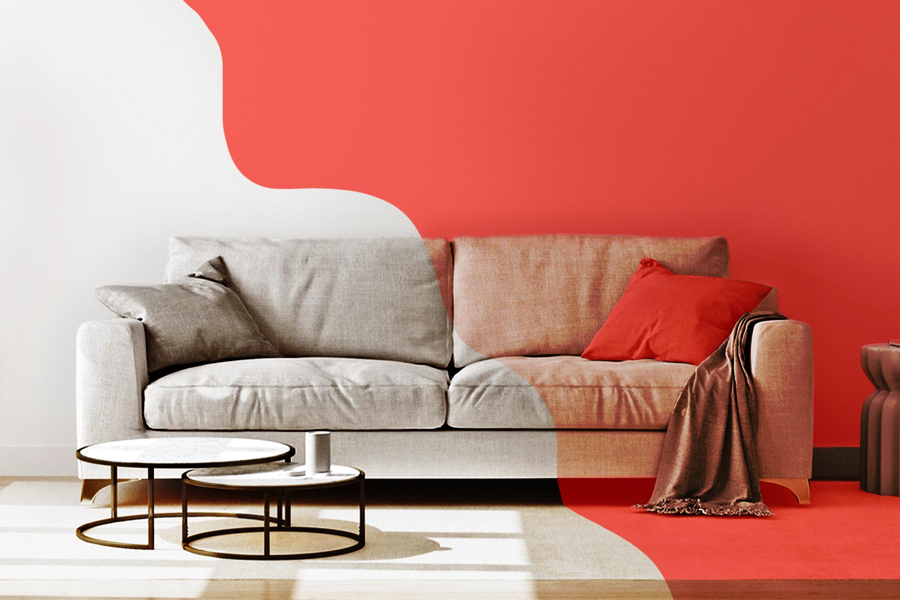
“It seems like more people are ready to accept colour in their life, but it’s a step-by-step process,” she says. “Maybe it starts with a pillowcase. Then a sofa. And, eventually, someone might find the courage to paint an entire wall.”