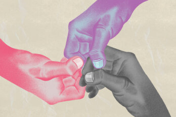
In an era defined by short attention spans, the game of trying to sell books is more complicated than ever. As a result, the book cover has become the publishing industry’s trustiest tool. Whether in a bookstore or on TikTok, a cover has to tell an 80,000-word story through a compact image and snatch attention, even if for a few milliseconds.
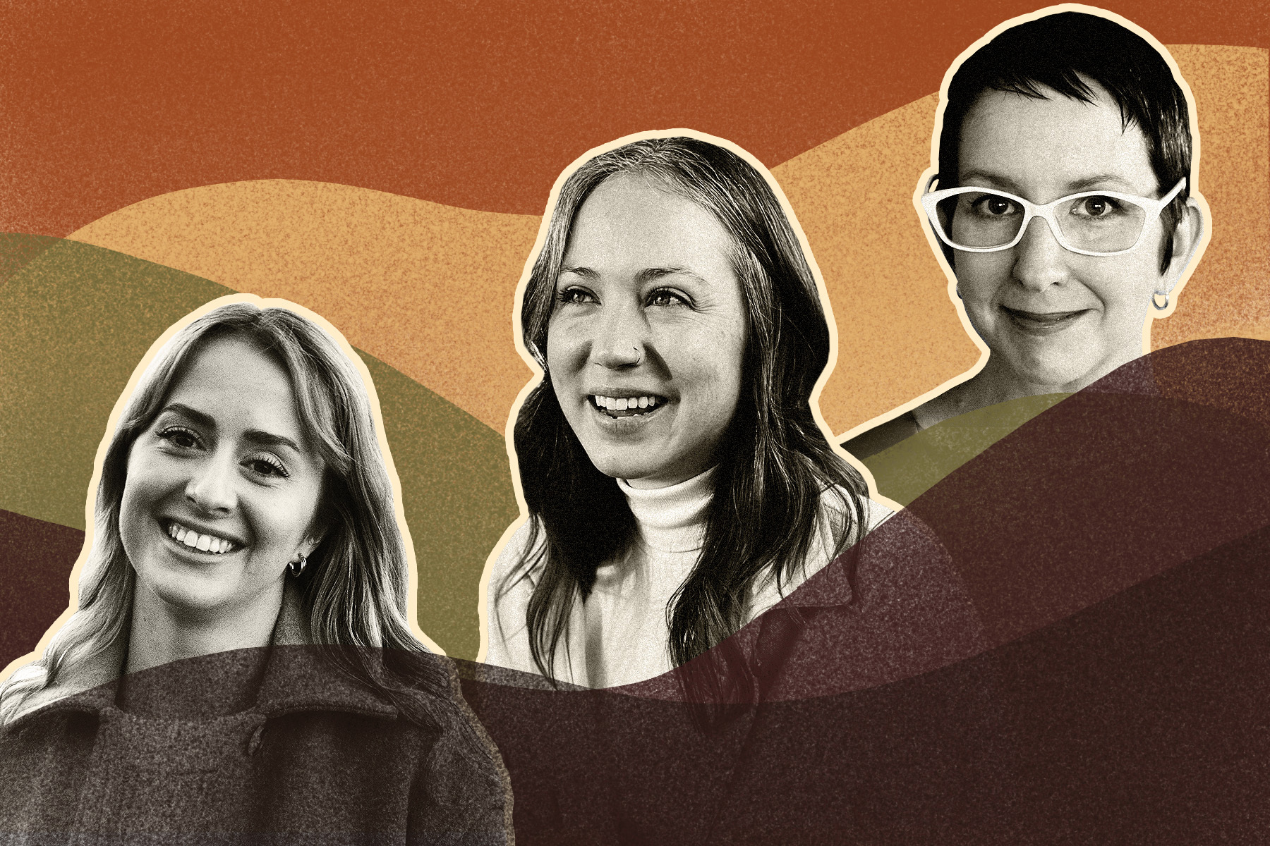
What do book cover trends—from swirling, abstract blobs to sunrise colours—have to say about how we choose our stories? And how do designers navigate a business where their art is used to sell books in an increasingly inattentive market? The Walrus held a roundtable with book designers Ingrid Paulson (a freelancer), Emma Dolan (Penguin Random House Canada), and Jazmin Welch (Arsenal Pulp Press) to find out the methods behind the design of contemporary covers.
This discussion has been edited and condensed for length and clarity.
KC Hoard: I’m going to start with a difficult question: What’s your favourite book cover?
Ingrid Paulson: The one that kept jumping out at me this year was The Ghost Sequences. The original cover artwork is by Olga Beliaeva, and it’s with Undertow Publications, which is a Canadian horror publisher. It takes a common trope: trying to make a skull out of humans. It’s two young girls that are forming the head. I’m a little startled by that. And then the hand lettering is very, very tight and subtle. It just gets out of the way of the image, but it makes it feel very soft. And also a little spooky.
Jazmin Welch: I love the cover for Rag by Maryse Meijer. It’s got this painting of a face that’s been stretched down, and it’s kind of shocking. It leaves such little space for the title. So, even though the title is really small and subtle in the bottom corner, the design still brings it to your attention because the face is pointing that way. It makes me want to read the book, because I’m like, “Who is this character? What does this pull on the face have to do with the story and the way that the character is represented?”
Emma Dolan: Every week, I see a new cover that I wish I had thought of. But a great one I saw recently is Yoga by Emmanuel Carrère. It’s a really great example of how a short book title goes a really long way in book cover design. If the title had been something like “A Subtle Little Book on Yoga,” this design would not have the same impact. And then you wouldn’t have all that beautiful negative space.
KCH: I’m already noticing that you’re all picking covers apart. What would you say the elements of an effective book cover are?
JW: One of the most important elements is a sense of leaving something out, not telling the whole story. The whole point of a book cover is to leave someone wanting to pick it up. It’s that intrigue that makes someone step forward and hold it and actually assess the cover.
IP: You have to ask a question. Especially if you’re in a bookstore and there are hundreds of books on tables, it can be overwhelming. A book cover should not only ask a question but it should also answer the question “What do I want to read right now?” So, that becomes a lot about trying to send little hidden clues to the reader to just say, “Hey, this is actually what you want.”
ED: Ideally, it’s about capturing the right reader. It comes down to mood and tone. If a book is really earnest, maybe don’t give it a quirky cover. As a book designer, you have to spend a lot of time with the writing to capture it.
IP: People ask, “How do you do it?” And I’m like, “I read the book.” And they’re like, “What?” They don’t understand that I read the book.
JW: The writing is just so important because it sets the mood. When you’re talking about not misleading the reader, we don’t want them to think that it’s the wrong type of book. We have such a small amount of space to tell such a big story. You read 80,000 words, and then you’re like, “Okay, what from those 80,000 words makes it onto this tiny little space?”
KCH: Are there specific things in a draft that you’re looking for, or is it just the general feeling that you’re left with after finishing a book?
ED: When I get a brief, which is a document put together by editorial that has production information and editorial information about the book, sometimes just from reading that, I’ll get some ideas. Then I’ll read the manuscript with that in mind. Ultimately, I’m just trying to get the voice.
JW: That’s a great point about the brief. You’re not just designing art. It’s a commercial product at the end of the day.
IP: The other thing, once you get beyond the creative brief, is to analyze the manuscript itself. I call it Lit 101. A lot of authors have a palette that they’re working through; some are conscious of it, and others aren’t. If the book is set around the ocean in the 1950s, you can immediately see what the palette would be. If it’s set in Miami as opposed to Connecticut as opposed to Halifax, you get an idea of what the colour palette would be. Once you start to get the colour palette, you try to figure out who’s the main protagonist, who’s the antagonist, what’s the crisis in the story. Sometimes, if I think that it’s going to have a person on the cover, I’ll have to be very specific about who it is. I just recently had a cover that was approved, and I was apologizing because I couldn’t find the right hair colour. And the author was like, “Oh, I don’t care about that, the image is perfect.” But at least it has the right mood.
ED: I think that idea about the representation of a character on the cover is such a tricky one. It goes back to what Jazmin was saying about not giving away too much. Sometimes it’s so important to have a human element on the cover, but if you depict somebody, that’s who they are for the rest of the time. I think that’s why there’s that trend of showing the back of somebody, because that could be anyone. It’s a common thing we use to have that human element that really draws the reader in without typecasting the main character.
KCH: How has your work altered your relationship with reading?
JW: As I’m reading, I’m always thinking about what I would have done, what colours are coming up, as Ingrid said, because there is this real palette that does emerge. I just read Sheila Heti’s Pure Colour. And, for a while, I was like, “Oh, was green the right choice?” Of course, it all comes together. (Green is a recurring motif in Pure Colour.) And I’m like, “Yeah, that makes perfect sense.” That book cover, for me, has become an iconic one of this year. So many authors that I’ve spoken to in the last year pull that one up as a reference. So I felt like I had to read it because so many people wanted their covers to look like that. But, once a cover becomes so well known, you can’t do anything like it. And, as I was reading, I was like, “Well, I don’t know what I would have done, because that seems like the perfect match.” It’s almost like the only solution that was left.
IP: Emma, I have a question, because I’m working with a lot of smaller publishers now. And I’m not always working with a hardcover-to-paperback transition the way that you’re probably doing now. Are you seeing that there’s still a demand to change the cover for a secondary audience in paperback?
ED: Yes. Big time. That’s mostly coming from sales because it’s exactly what you say: it’s to try and capture either a new market or a broader market. It’s the one thing we can try, right? You’re not going to change the writing, but you can change the package. So it is common. And it’s funny because often it happens on books that were the most fraught to get to the perfect cover. And it took so long, and we finally got to it, and everyone’s high fiving. And then the second format comes around, and it’s like, “Okay, new covers!” Like, I’m still recovering! But I think there’s fun stuff you can do with that. You can riff on the first format and do something cool, like change the palette up in some kind of radical way. But what we end up doing a lot is going for a more commercial look for the paperback.
IP: I always wondered if it was going to be more like music, where the cover starts to be the identity that goes through different formats, no matter what. Because there’s so little play at the beginning. It doesn’t get in front of enough of an audience, except in the bookstores sometimes.
ED: The more times you see a cover, the more you start to think, “Oh, that must be something, I’ve seen it here, I’ve seen it there.” I think it’s just a decision made to broaden the market for it.
IP: If you’re going hardcover, it used to be that you were doing it so you can get into the prizes because they would not accept paperbacks. And, nowadays, they do accept paperbacks. So that’s kind of out the door. But, a lot of times, I get the feeling that hardcovers are done to preserve the first edition. This is the definitive book, and then the commercial is the second take.
ED: Before I got into book design, I had no idea that a book had more than one cover. And most people don’t notice it. But it’s more confusing to most people than anything else.
KCH: Let’s talk about trends. This whole roundtable was spurred on by a conversation within the masthead about the book blob trend (a cover with multicoloured, swirling, abstract shapes that has appeared in various iterations on a number of bestsellers in recent years).
IP: The unicorn frappuccino.
KCH: What does that mean?
IP: It was basically the extension of the book blob. Every cover looked like a riot of glitter and rainbows and gradients, and there was usually a figure or two in it, but they were very obscured and very stylized. And then the type was interacting with that. And I’ve seen a big transition now into the cascading-title-among-flowers look. I think it really started with publishers that were trying to deal with books that were centred in nonwhite communities, like The Vanishing Half, and trying to show figures without showing Black figures. Every single author of colour would have these colourful covers that ended up being a signal that this was an Indigenous or Black or South Asian or East Asian author.
ED: There are a few things that contribute to a trend like that. A big part of the discussion when you get a new book project is comparative titles. That’s covers that are already on the shelves that editorial and sales can point to, to give the designer a sense of what styles are feeling right for the book in the market. When a book does well, naturally, it seemed like a package that worked. It’s pretty common practice. But it can also lead to this oversaturation of a trend, like a book blob. How readers buy books is a big factor. We have to be mindful that a lot of people buy books online, and they’re only seeing these on a screen, and most of them on their phones. So big, clear white type and an eye-catching colour palette are really helpful for that. We’re strongly encouraged by publishers to do that.
JW: It’s funny that they all start to look the same. But when you’re doing this big blob, your only option for type ends up being a big, bold white type, because nothing else will show up on that background. People are really asking us not to do this anymore, because when you are scrolling on Amazon and looking at thumbnails, you are just seeing these little blobby things that look like camouflage, and you can’t see what’s happening in the background.
IP: I’ve been doing this since 1998. So I’ve seen a lot of trends, and in the aughts, it was achingly slow trying to get new trends in Canada going. But, lately, you blink and you miss it. I know from talking with booksellers that in physical stores they prefer if the covers don’t look alike. So they’ll actually try to place them far away from each other just to give the books a fighting chance. I’ll ask you guys: What are you seeing? Because I’m seeing pastels right now. I’m seeing super-washed-out pale pinks and yellows and sunrise colours.
JW: There are these covers where things are put into different segments, almost like a comic strip. But they’re not telling a story. It’s more abstract. It will have black outlines and different squares and then a visual on each section. And I find them really interesting to look at.
KCH: Do you find these trends limiting, or do you find them helpful?
IP: It helps me figure out how to connect with an audience right now. I mean, there are no new ideas anyway. I do work for smaller publishers who can take bigger chances and try to reach the audience. They want to promote, and the biggest and most cost-effective way is through the cover. So the cover becomes the promotional tool. And for it to follow a little bit of a trend, to fit in and stand out, is the sweet spot.
JW: It’s a nice starting point. I wouldn’t say that trends are a hindrance to my work, but it’s more so that people will come with that brief of comparative titles. So you have that as a reference of what’s working in the market, what’s been selling well. It gives you something that you can either take inspiration from, or make sure that your book is in conversation with that trend on a shelf, or just completely go in the opposite direction and buck that trend and not consider it at all.
KCH: I’m really interested in what was said earlier about how a lot of people are moving to reading books on their phones or on an iPad. Why do book covers endure as an art form?
IP: It’s the face. It gives a personality to the book before you read it. In a bookstore, you have one and a half seconds to stop somebody. And you have three seconds to get them to actually pick up the book and turn it around and read the back. Online, it’s even faster. It’s a blur. Even if they’re reading them on devices, we just need to be able to present the book as its own entity, its own unique face.
ED: I think people have books as objects. And I think tons of people buy books and don’t read them, just because they love the objects as much as we do. Of course, you hope they read it. But there’s a lot out there. So they are beautiful objects. And I hope that continues.
JW: It’s creating the world of the book. Some people may be buying books for the cultural capital of having this beautiful library when their friends come over. But there’s a whole world of book lovers out there. And when we think of the digital space, it’s about creating a connection to the author. Having that connection to something that’s more tangible than just these pages. If you were to read an e-book without a cover, what would that even be? It’s not even a book. You don’t have that connection to some visual language and the person who creates it. It’s missing something.
IP: Authors will say, “I don’t really think I’ve written a book until I see the covers.” Suddenly, it becomes a book to them. It’s a source of delight for the authors themselves to see their work packaged in such a way.
ED: I’ve heard them even talk about the interior of the book, seeing their writing with the margins and folios and everything. And that is an extension of the package, right? On an e-book, I could just scroll through forever, but there is something so special and specific about the pages of a book.