Listen to an audio version of this story
For more audio from The Walrus, subscribe to AMI-audio podcasts on iTunes.
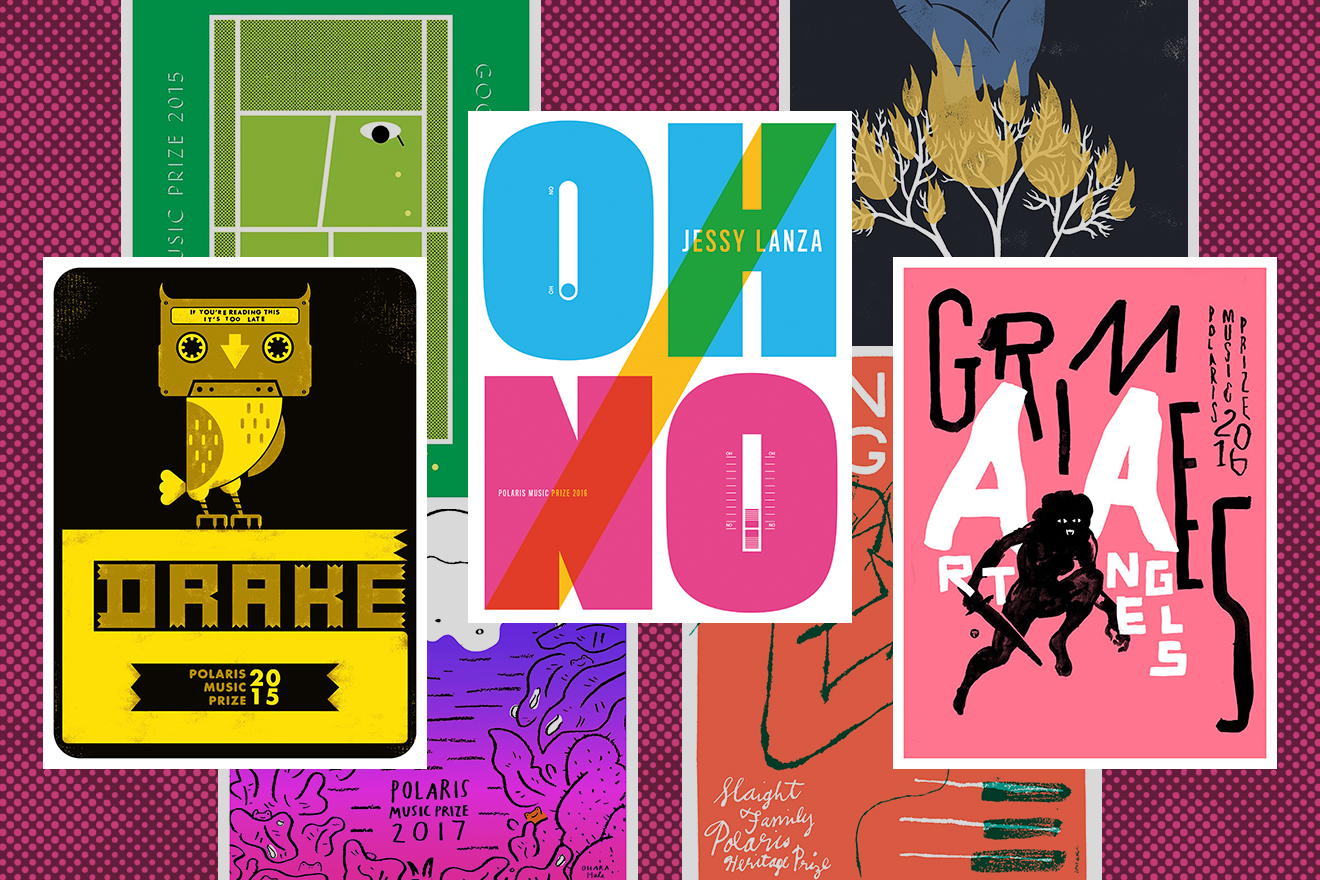
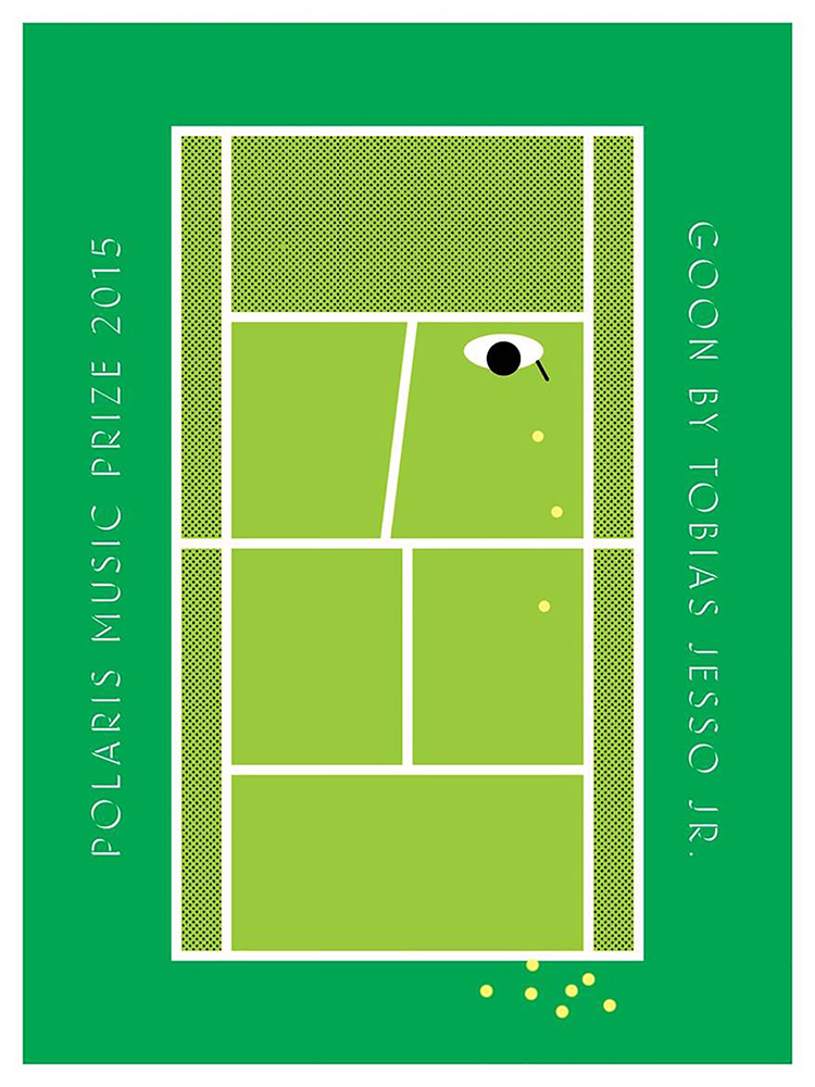
For many music fans, a great night out starts with a stamp on your hand and ends with a roll of paper under your arm: after the lights come up and the band moves on to a new city, a gig poster is proof that you were in the crowd and a reminder of how you felt being there. Some gig posters feature graphic styles so remarkable that they have gained a kind of cultural immortality, coming to represent the genres and eras for which they were commissioned. The bright, psychedelic images and warped text that evoke 1960s rock are a style popularized by poster artists, including Wes Wilson and Bonnie MacLean, promoting concerts at venues like the Fillmore Auditorium, in San Francisco. Punk music from the ’70s and ’80s is rendered in grainy black and white in public memory, as if freshly spat out by a Xerox—a cheap publicity machine used in those days by musicians and their fans. Iconic posters are still reprinted and sold to collectors decades later, long after the shows they were made to commemorate.
Click on any of the images below to see a larger version.
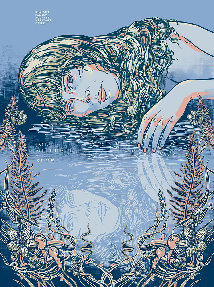
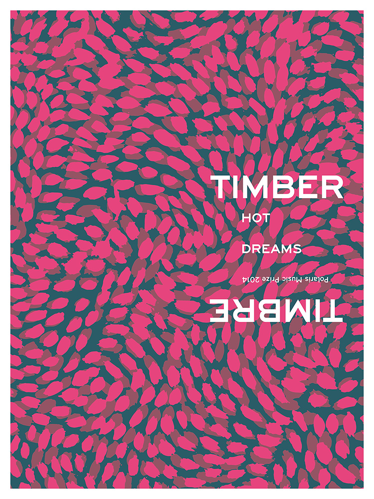
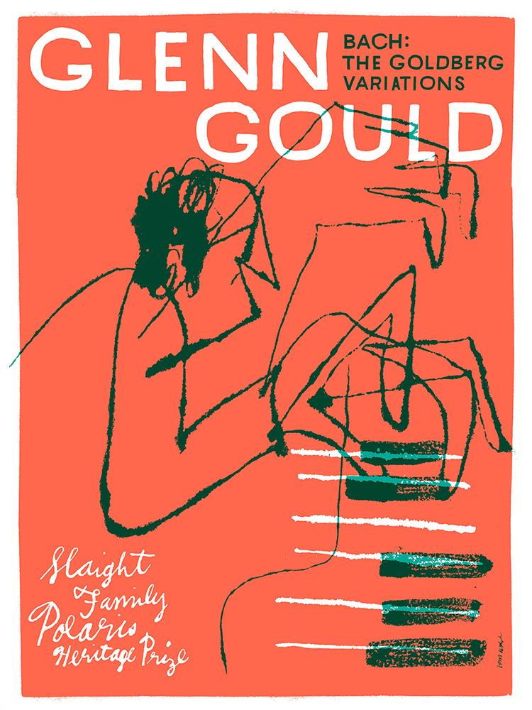
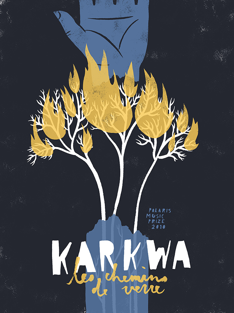
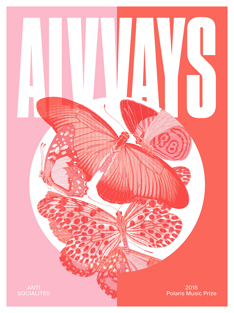
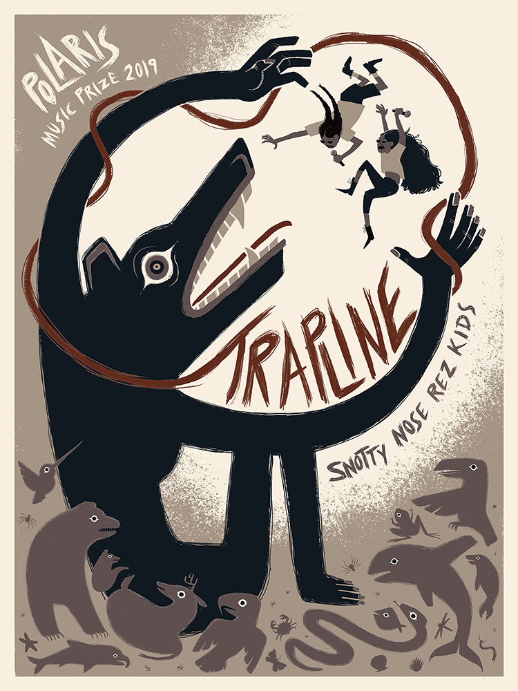
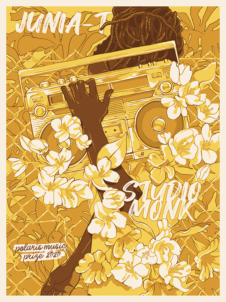
When the Polaris Music Prize was launched, in 2006, it decided to tap into this tradition, drawing on the long history of gig posters as part of its celebration of musical excellence. (The award is given annually to the album a jury of music critics deems the most artistically successful; since 2015, heritage prizes have also been awarded to albums that were released before the Polaris Prize was created.) Intended to become “beautiful and rare mementos,” the posters signal that the Polaris is closer to the concert scene than to the red carpet. Nominated musicians are given a framed print of their poster to commemorate their achievement; other copies are distributed to the poster designer and to Polaris partners and sponsors, and the remainder are sold to fans.
It was Polaris founder Steve Jordan who landed on the idea of commissioning posters for shortlist nominees. (Jordan left the organization last year.) Giving out traditional award statuettes didn’t fit with the spirit he wanted for Polaris, and he was inspired to take an alternative approach after walking through the Flatstock poster exhibition at the South by Southwest (SXSW) music festival. Early on, poster designers came from the gig-poster scene. More recently, Polaris has been collaborating with The Office of Gilbert Li, a Toronto design studio, to expand the pool of visual artists it works with. To find designers, Polaris puts out an open call for portfolios on social media after the longlist of albums is released; the studio’s creative directors also research potential candidates. Together, Polaris and the design studio decide the pairing of artist and album, which the curators consider the most important element in each poster’s success.
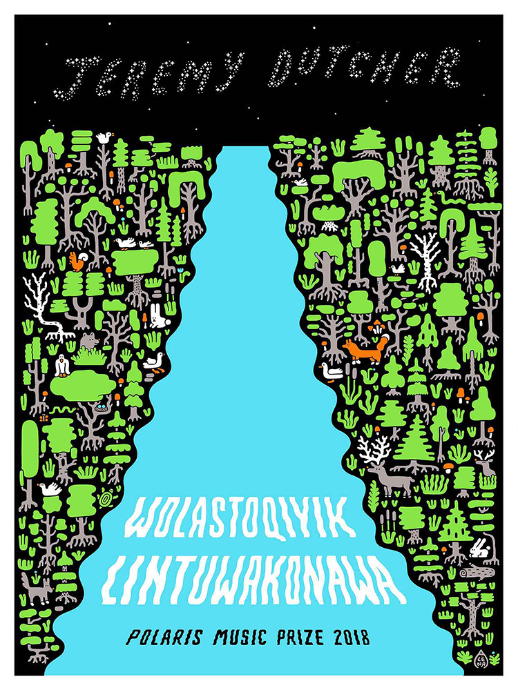
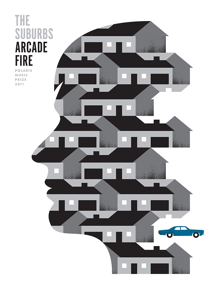
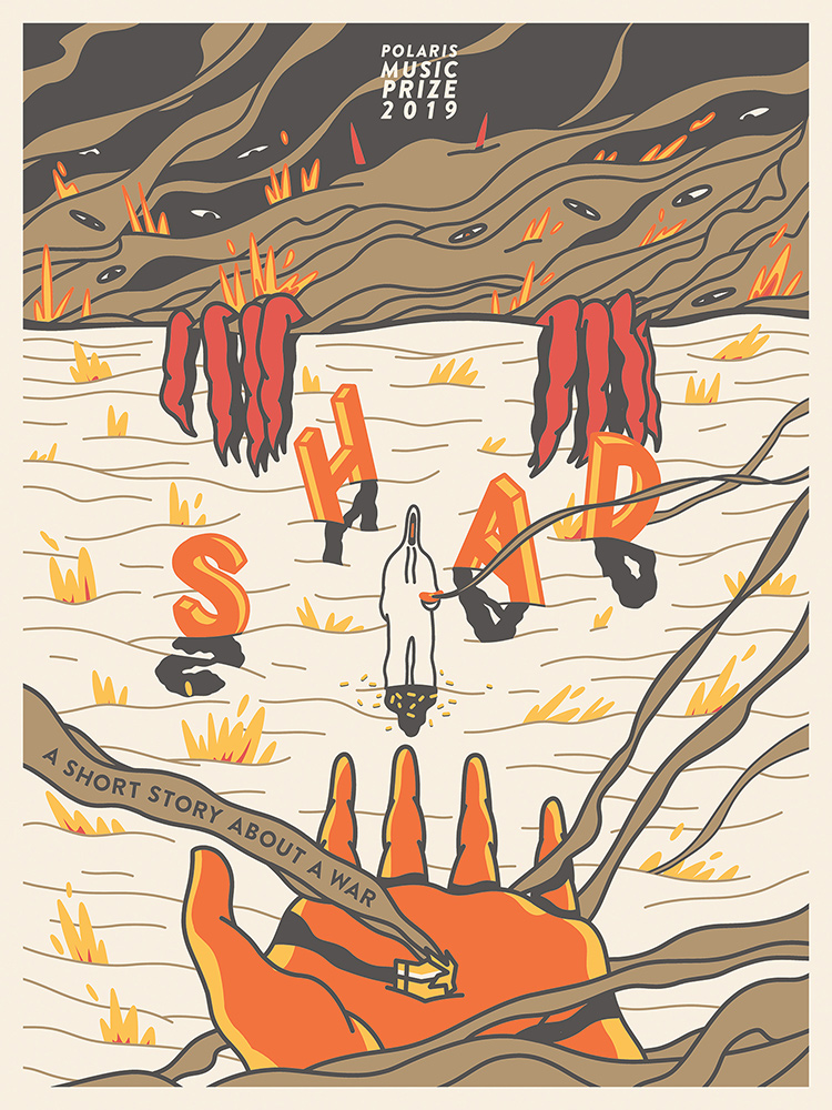
Many factors go into selecting poster artists, including demographic and geographic diversity as well as professional background. Over the years, Polaris artists have included commercial and editorial illustrators, fine artists, and other graphic designers—people who may not have made a gig poster before, selected in the hope of getting surprising results. Li says that an artist’s distinctive aesthetic is a big part of why they are chosen—sometimes even because it differs from the existing look and feel of the album in an interesting way. “We don’t want you to copy what’s on the album cover,” he explains. “We want this to be a pure expression of your response to the album and the music.”
Some gig posters feature graphic styles so remarkable that they have gained a kind of cultural immortality.
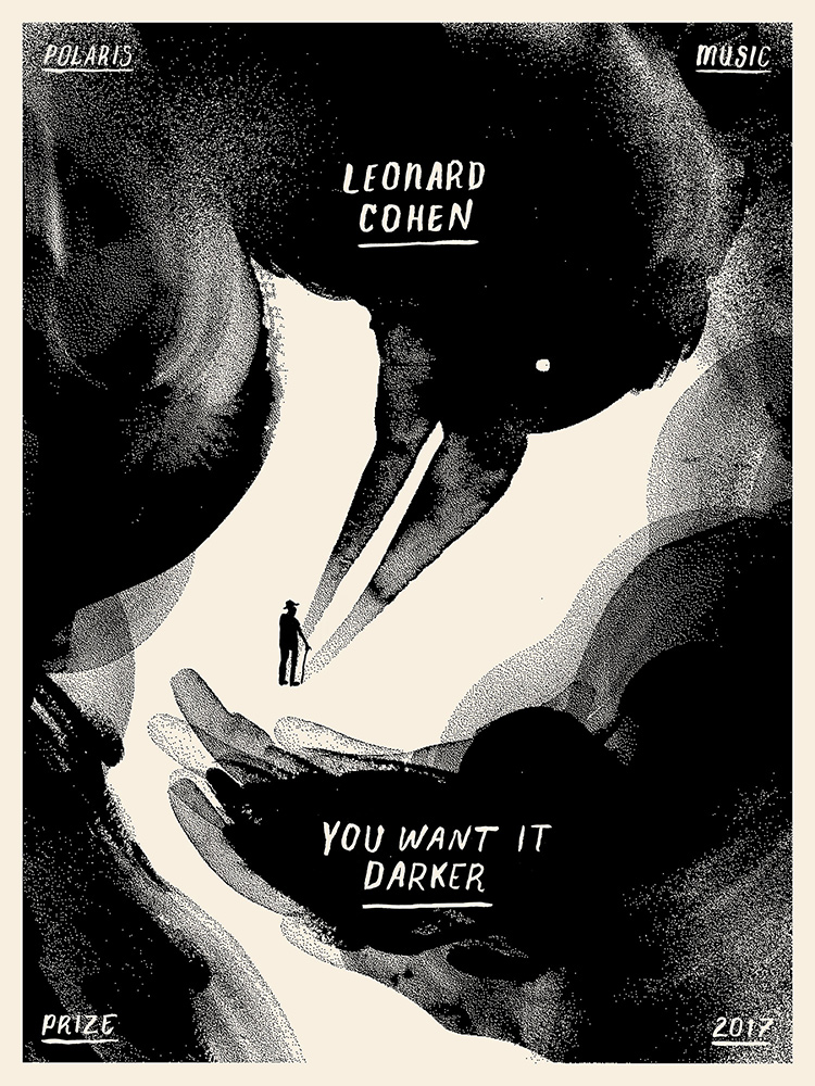
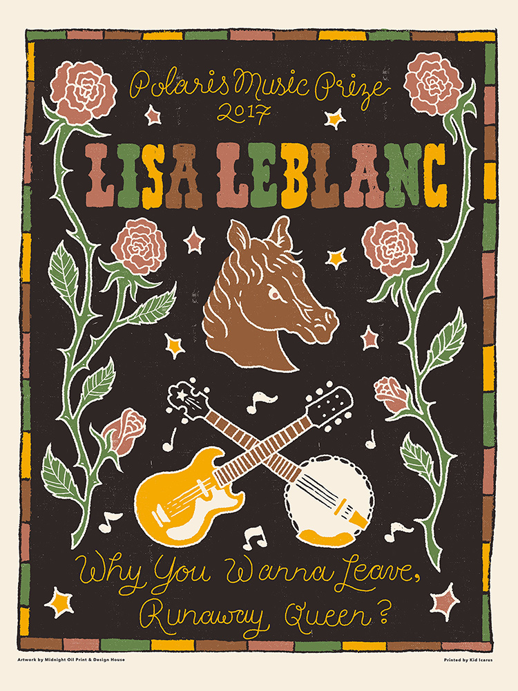
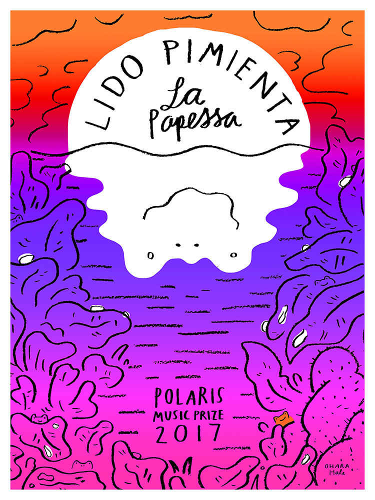
Creating a Polaris poster comes with an unusual degree of creative freedom: beyond the inclusion of a few mandatory text elements—the musician’s name, the album title, the year, and the words “Polaris Music Prize”—the design is generally up to the artist. Designers frequently incorporate their own interests and include personal touches like hand lettering. “I always love the design challenge of being able to put the text in and the art at the same time and have them work harmoniously,” says Ohara Hale, who illustrated the poster for Lido Pimienta’s 2017 winning album, La Papessa. To Hale, the act of creating art and music are, at their core, the same. “What we’re expressing, what colours we’re using, what notes we want to play, what instrument we choose, how we want to sing—it’s all the same.”
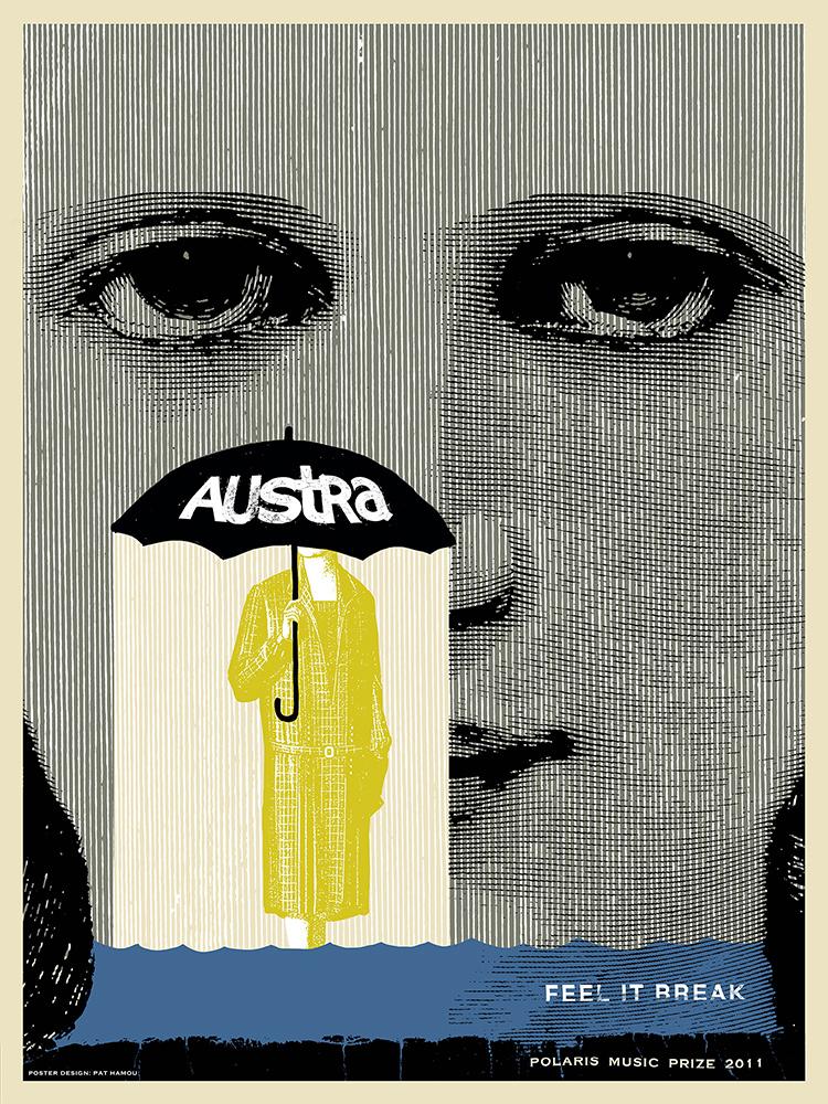
Kid Icarus, a screen-printing studio and shop in Toronto’s Kensington Market, has been the sole printer of the Polaris poster series since 2011. An edition of forty four prints is produced of each Polaris poster. Although all printmakers aim for consistency, some irregularity is expected with the screen-printing process—alignment can be off in some copies, ink unevenly distributed in others. “That’s my favourite part, you know, the happy accidents,” says Stephanie Cheng, a Polaris poster designer and former screen printer at Kid Icarus. “You really see the artist’s touch when there’s a little bit of an imperfection.” Some musicians agree. Josh Zucker, a guitarist for the 2009 winning group Fucked Up, says that screen-printed posters and the work that goes into producing them feel “like a labour of love.”
Most often, musicians first get to see their posters at the same time the rest of the world does. Zucker says that a good poster almost feels like a remix of the album. “You get a picture into the way somebody sees your music, the way that they translate it into their art.” Four-time nominee Shad has kept all of the posters Polaris has commissioned for his albums. To him, they don’t seem like commercial assignments, and receiving them is an honour. “I always feel that way whenever anyone spends time with my music. But, when then somebody creates something and it’s proper and it’s really good and it’s framed, you know—for me, that’s a significant gift. And so, I’ve hung on to those.”