
Julia Dault
 Jody Rogac
If one phrase could sum up the work of Julia Dault, it would be “Making is thinking,” which she attributes to New York sociologist Richard Sennett. Born in Toronto, Dault studied art criticism and now teaches at Parsons the New School for Design in New York. While her pieces are conceptual, relying on such devices as a fixed series of steps or processes, she eschews the too-perfect finish. “Dirty minimalism” she calls it, a minimalism in which her hand is clearly seen in the work. The result is a charming frankness and a surprising complexity.
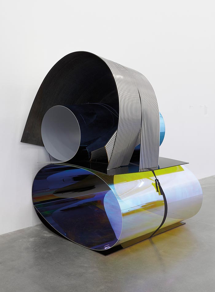
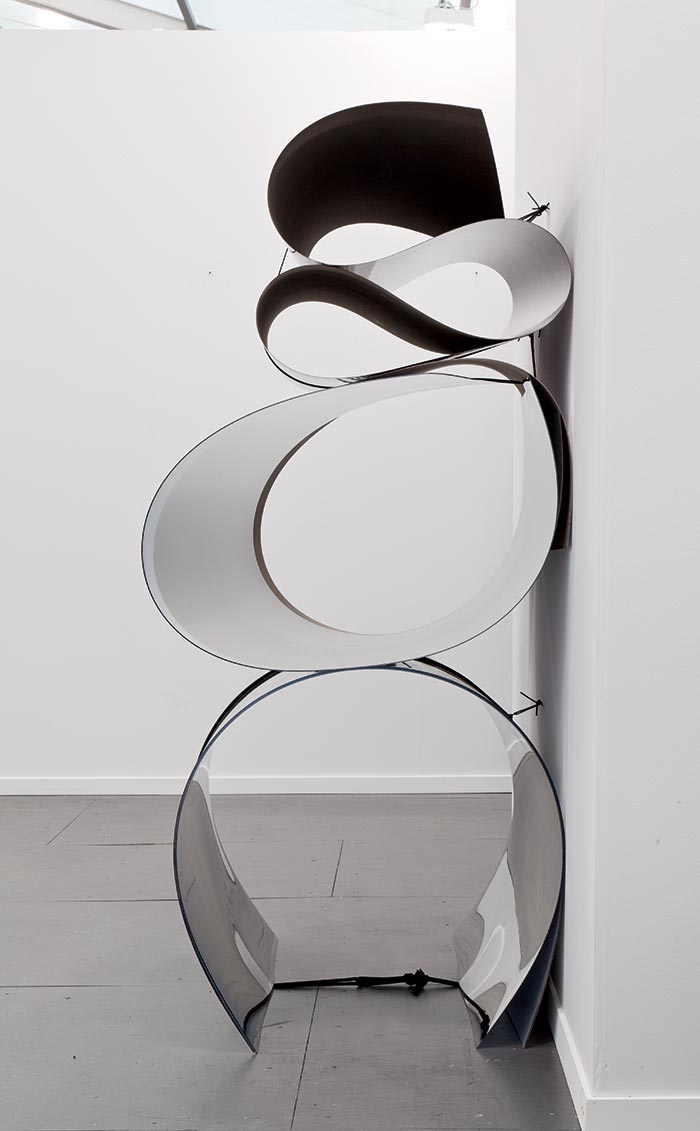
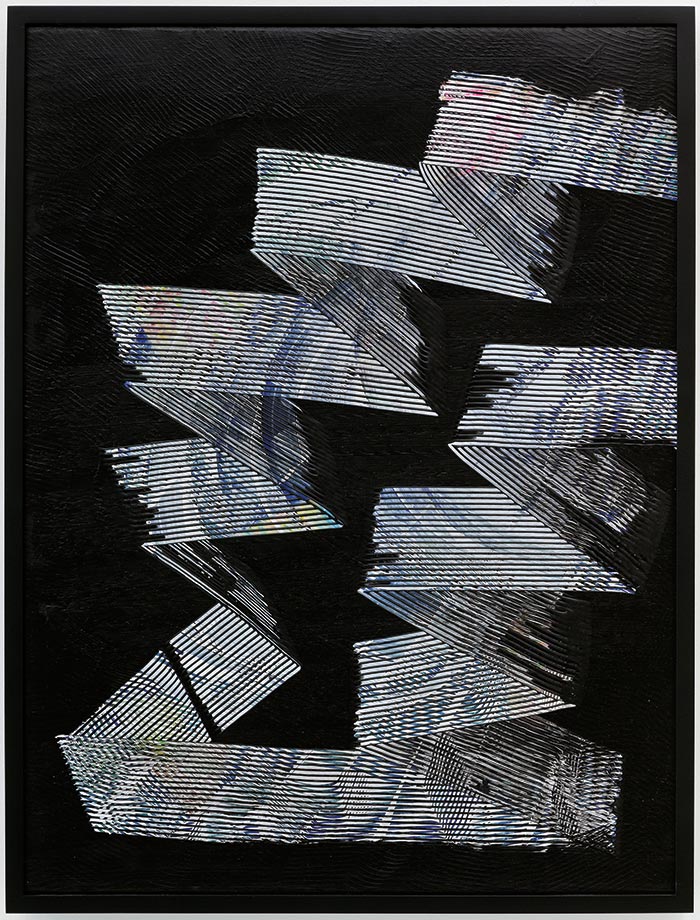
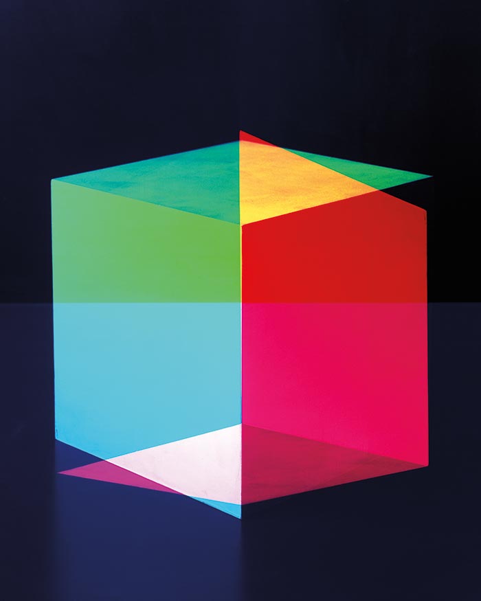
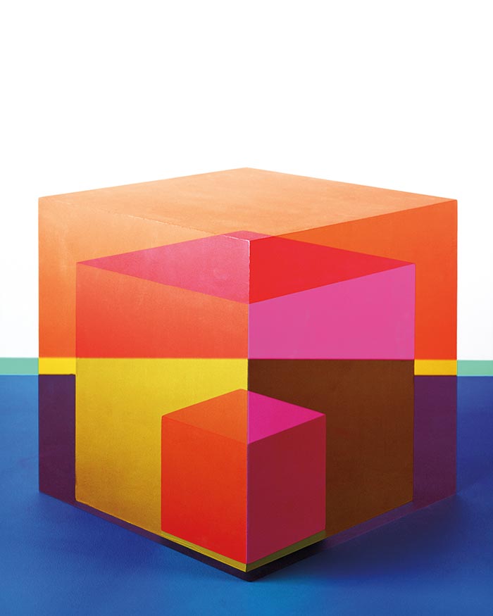
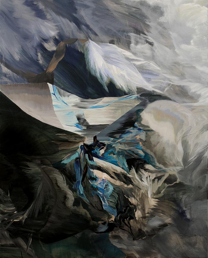
She builds her sculptures herself, in situ, never asking gallery staff to install them, using sheets of Plexiglas and Formica bent with a mason’s line and Everlast boxing hand wraps. Looking at them, you can feel the effort she expends in forming the sheeting into a stable configuration; the pieces seem almost dangerous, as if at any moment they could spring apart and strike you. Each is titled with the time of its making: for example, the sculpture at left is called Untitled 29, 2:30 pm–5:45 pm, May 7, 2013. In her paintings, too, her hand can be observed in the scrapings and whorls that reveal the underpainting or the fabric from which the artwork is made.
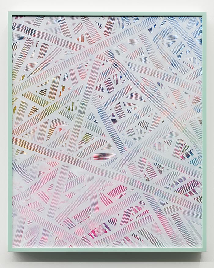
Dault seeks an edge of taste, a jolie laide (beautiful hideousness), reminiscent of the wry humour of Pierre Bourdieu’s famous study Distinction, in which he showed paintings of tree bark and cabbages to members of the petite bourgeoisie and plotted the result. She does not mix her colours, nor does she use brushes, preferring to employ a combination of homemade contraptions and tools sourced from hardware stores. Some of her marks recall the look of raw tiling cement, but if the making sounds simple the effect is not. Both her paintings and her sculptures play with opacity and translucence, referencing such artists as Gerhard Richter, Chris Cran, and Richard Serra. They are beautiful—a somewhat paradoxical result that nonetheless pleases their creator.
Jessica Eaton
 Jody Rogac
For sixteen years, the German poet Johann Wolfgang von Goethe patiently investigated colour, observing the effects of afterimages, and of the spectral hues produced by heating polished metal plates or trapping condensation between sheets of glass. His experiments broke new ground in the study of the phenomenology of colour, and his 1810 Theory of Colours inspired physiologists and colour theorists and was widely read at the Bauhaus. “Colour is a deception,” proclaimed one of these readers, the German painter and teacher Josef Albers. “In visual perception, a colour is almost never seen as it really is—as it physically is.”
Albers and his Bauhaus colleague Johannes Itten demonstrated that the same colour can be perceived differently, depending on the one beside it. There are numerous reasons for this, but the principal one, as the neuroscientist Mark Changizi has argued, is that our eyes are attuned to human flesh tones, which allows us to discern such qualities as the emotions and health of others; a good deal of our perception of colour outside of this is contextual. It is this complexity, and the potential emotional power of colour, that makes it an interesting field for investigation.
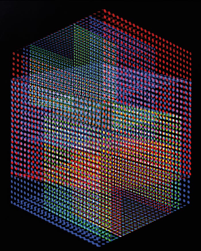
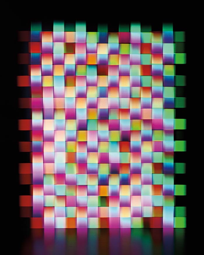
Regina-born, Vancouver-educated Jessica Eaton patiently mines this subject. In her series Cubes for Albers and LeWitt (cfaal), she explores these and other optical phenomena by repeatedly shooting grey cubes onto the same four-by-five-inch negative, using different gels and exposures. “I started working with the tricolour process in 2004 or so, having found it in an old Kodak photography manual,” she says. The results look rich, but why shoot these cubes? Why not make them digitally? Because the camera captures little imperfections—life, as it were—and proceeding from nature allows for unexpected discoveries.
Another important thread in her work is an indifference to representation. Abstraction is inherent in the medium of photography; it is only through the act of framing that the recognizable image is revealed. If the photographer shoots not you but the ground on which you are standing, you get abstraction—or another form of representation. Some of William Henry Fox Talbot’s first images were of objects placed onto treated paper, an idea later taken up by Man Ray and László Moholy-Nagy. While these experiments were conducted at the same time as the rise of abstraction in art, photography came to abstraction on its own terms. “What light does, a photograph is, and we can see an image only at the behest of impeded light,” wrote the critic Lyle Rexer. What Eaton does, in effect, with gels and multiple exposures, is carefully explore this impedance to its fullest extent. Like all research, it is in the slips and accidents that real advances are made. These she has described as “photographs I wasn’t able to see before they existed.”
127 × 101.6 cm.
Aurel Schmidt
 Jody Rogac
Drawing as a medium has historically been viewed as somewhat provisional. It was where the thinking and planning took place, where proof is required for the napkin scribble to be declared art. Often, this proof is found in virtuosity.
Drawing also has a more open pictorial structure than painting, due in part to the scale of the mark-making instrument, say, the pencil. Often, the support—the paper, for example—shows through. But these limitations can be turned into advantages by an obsessive attention to finish. Aurel Schmidt’s hand recalls the obsessiveness of the Victorian Richard Dadd. It comes as no surprise that she was praised by the Whitney Museum of American Art for her “exquisite draftsmanship.”
Schmidt did not attend art school. In 2005, after leaving high school in Kamloops, BC, she moved to New York and threw herself into the art scene. Two years later, dealer Jeffrey Deitch offered her a solo show, and by 2010 her work was on display at the Whitney Biennial. She now manages sales herself, having discovered that representation can sometimes become a Faustian bargain. “There was a point where I had assistants and the studio Jeffrey gave me and all this stuff,” she told the New York Times. “I don’t know if I was making more work, but I was feeling totally stressed out that everything I made was somehow his.”
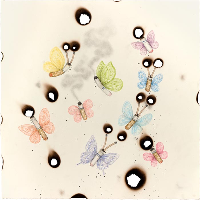
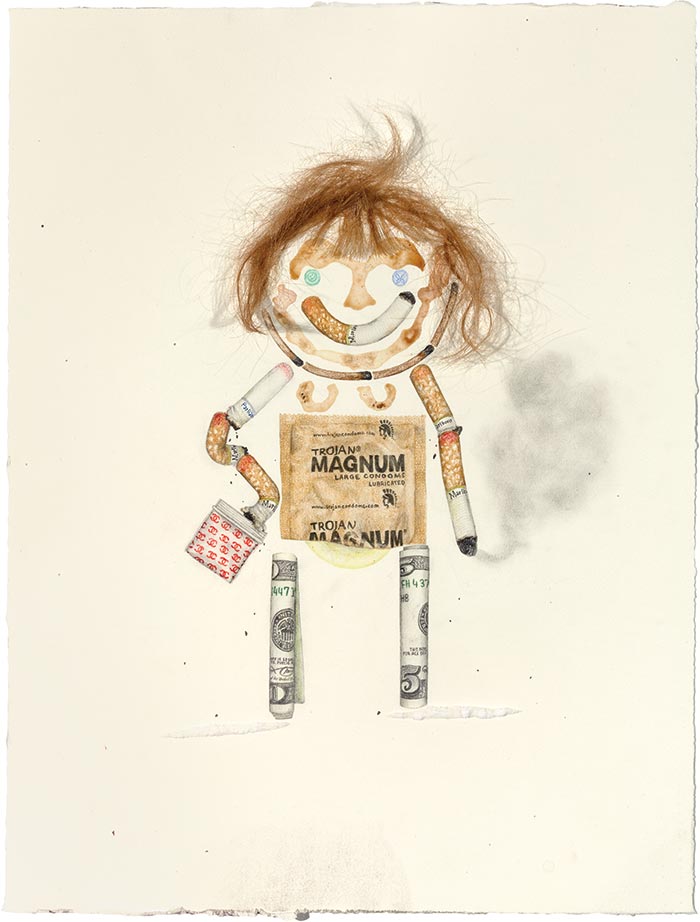
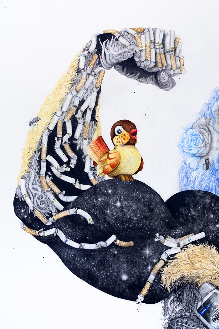
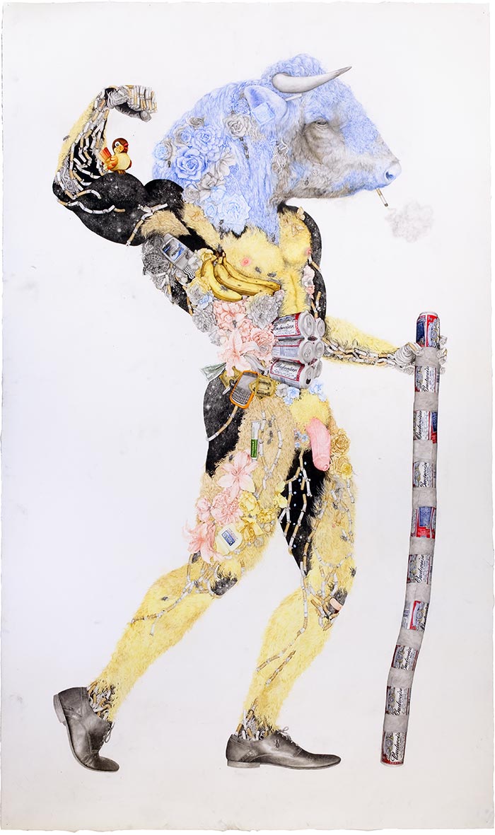
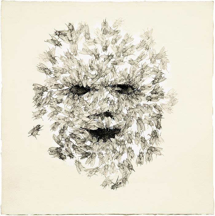
In much of her art, we can’t tell at first what is going on. We are presented with a wild, grinning face. Only when we lean in do we see that the image is composed of human detritus and the markers of death: cigarette butts, condoms (petites morts), beer cans (dead soldiers), and maggots.
Disgust has long fascinated artists and philosophers alike because of its push-pull effect—what Aristotle, in connection with drama, saw as the paradox of tragedy, and what the French thinker Julia Kristeva called “a vortex of summons and repulsion.” Often, we can’t take our eyes off something we find deeply disturbing. Rubens and Goya (and, more recently, Paul McCarthy, Damien Hirst, and Marc Quinn) have dealt with this powerful sensation. In Schmidt’s case, we are lured in by a desire to better understand the image, hit by revulsion but in the end staying for the catharsis—admiration of the perfection of her technique.
Raymond Boisjoly
 Jody Rogac
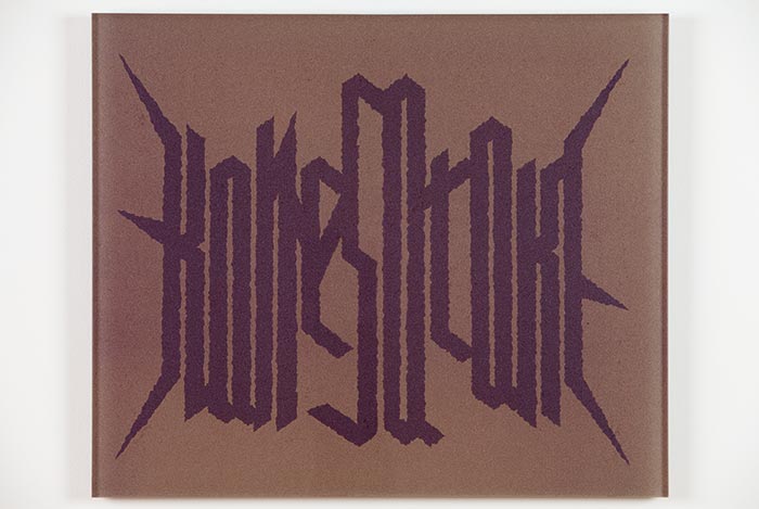
In the summer of 2010, carver Robert Yelton floated a suggestion, taken up by the chief of the Squamish First Nation, to rename Vancouver’s Stanley Park Xwayxway, after the village that once occupied the site. The public reaction was sadly predictable; the idea was dismissed, and many responses were laced with ignorance and racism. Less predictable was Raymond Boisjoly’s riposte. His Writing Lesson series was a sharp, economical satire in which he rendered familiar Aboriginal place names, such as Nanaimo, Spuzzum, and Chilliwack, in a visual grammar that Internet trolls might find more acceptable: that of Norwegian black metal. Some musicians who practise it may have won the Eurovision song contest, but others were implicated in the burning of medieval stave churches because they occupied the sites of former pagan shrines. Even now, you can buy a candle cast in the shape of one of the churches that was set ablaze.
Boisjoly’s methodology harks back to the mocking style of the Dadaists and their cousin Marcel Duchamp, who opened up new possibilities for art. The notion they hatched—that the idea, not the form, should have primacy—has become a convention. Many Vancouver artists, such as N. E. Thing Co., Rodney Graham, Brian Jungen, Steven Shearer, and Myfanwy MacLeod, have taken up this ideas-first model with, as others have observed, “humour and erudition, coherence and eclecticism.” Still, the form has revolutionary origins. The artists who presented the Cabaret Voltaire in 1915 used cathartic satire to point out the absurdity of the slaughter taking place all around safe, neutral Switzerland; indeed, they ended up in Zurich because of it.
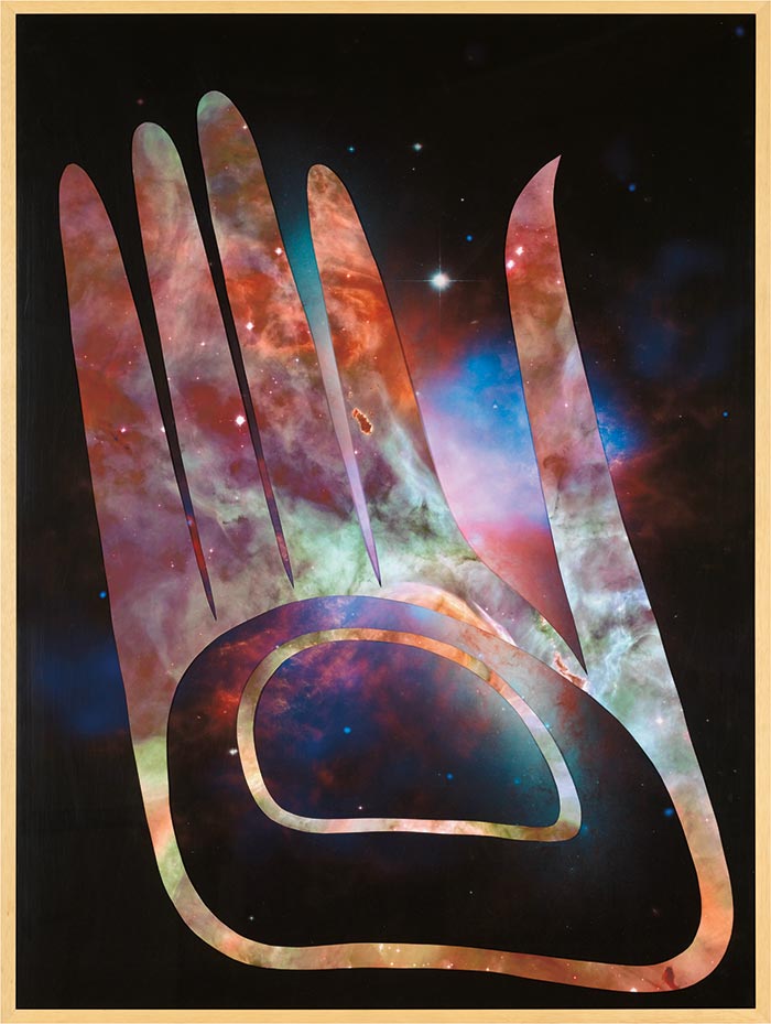
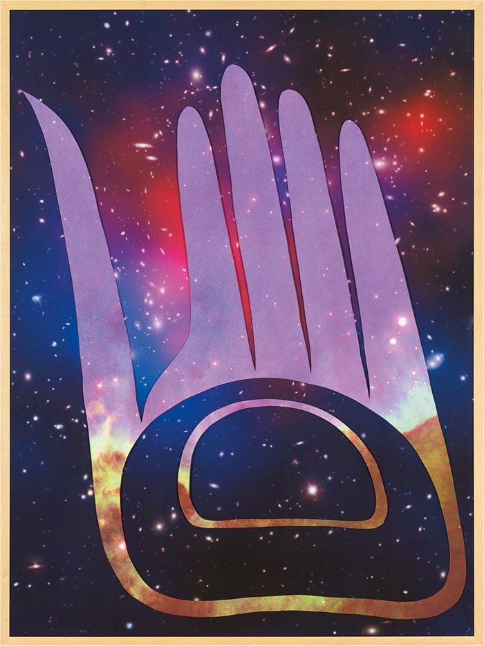
The son of a Haida mother and a Québécois father, Boisjoly finds himself at the boundary between their two worlds. In a sense, he serves as a translator, compassionately presenting the complexities of contemporary Aboriginal experiences via a form rooted in the present day. This seems to parallel the literary critic Craig Womack’s call for criticism that is loving, imaginative, and grounded in material reality. Boisjoly’s is also an art that thinks. These tendencies can be seen in his series An Other Cosmos. Here, Northwest Coast First Nations designs are overlaid on images from the Hubble telescope, the latter a reference to the cosmic album art of the music collective Parliament-Funkadelic, which espouses an inclusive take on Afrofuturist notions of black space travel and liberation.
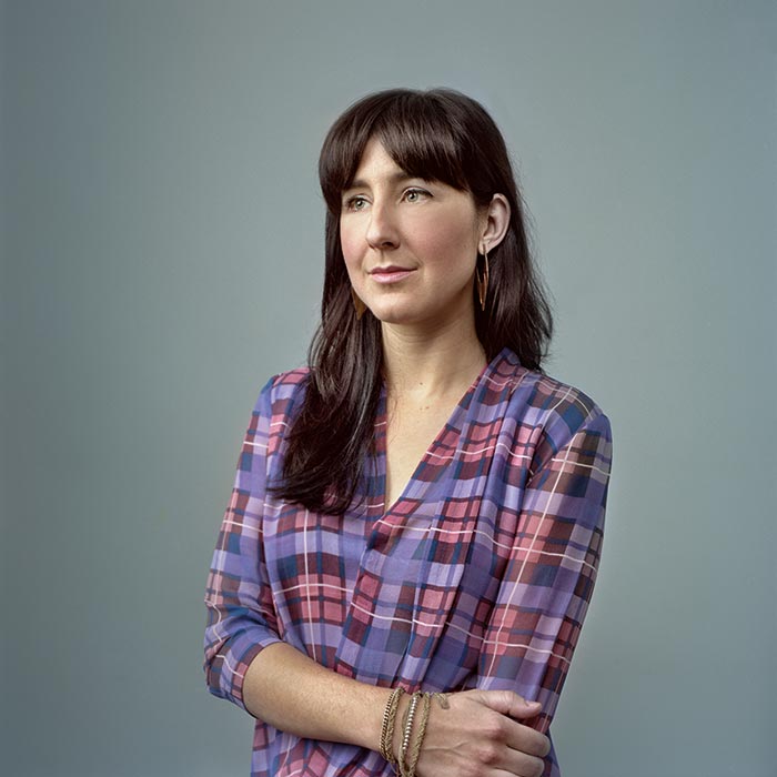
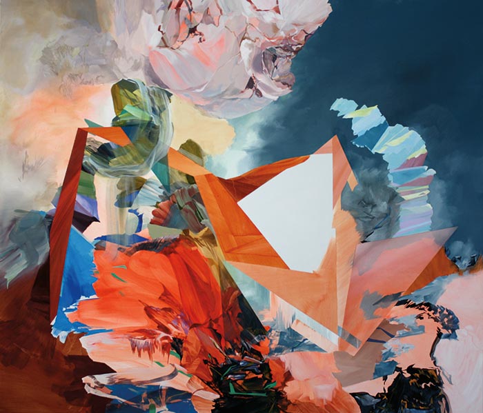
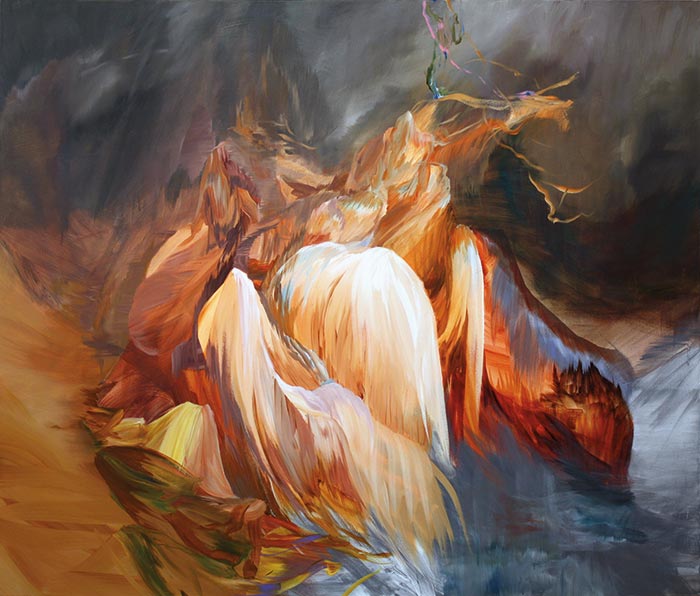
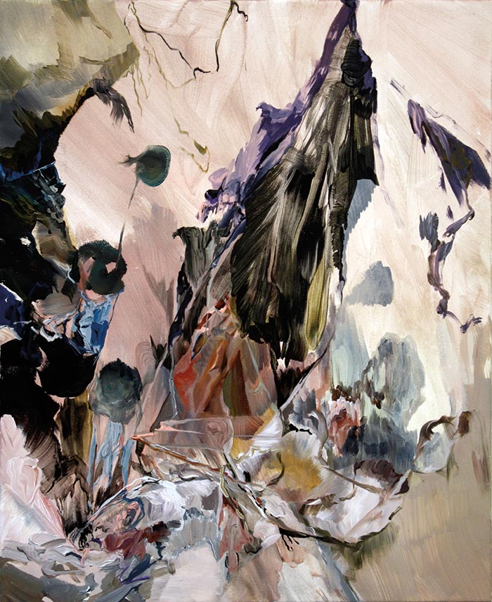
Melanie Authier
 Marc Fowler
The sniff test for any piece of art, and painting in particular, is whether you lose track of time as you stand before, or within, it. It is difficult to do abstraction well, and by abjuring the tools of storytelling, abstraction makes grabbing the viewer in that way just a little harder. In 1961, Clement Greenberg, one of the critics who promoted abstract expressionism, pronounced that “nineteen out of twenty—nay, ninety-nine out of a hundred—works of abstract art are failures.” He wasn’t talking out of his hat.
The belief that the province of painting is space (while that of poetry is time) was widely held even before the German critic Gotthold Ephraim Lessing put it on paper in 1766. The question modernity posed—first articulated by Gustave Courbet, and more dramatically by Édouard Manet almost 100 years after Lessing—was what type of space.
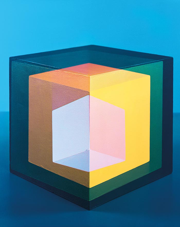
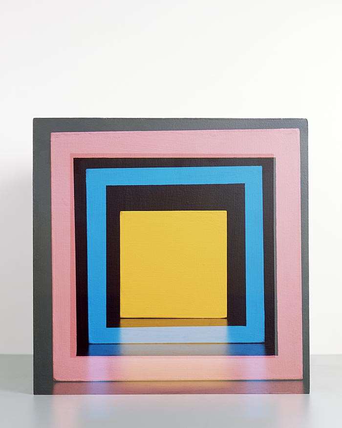
Within a painting, there is potentially illusionistic space, which an artist can create by invoking perspective, and then there is the planar space of the canvas or the panel from which the artwork unfolds. However, for a painting to be successful, abstract or not, the illusion and the flat design need to sing in harmony. Adding colour, which on its own can imply space (blue recedes, yellow advances), presents yet another challenge. It makes the task easier if the painter concentrates on the planar space; easier still if she uses a formal structure, such as a grid, and reduces the colour conversation to a few hues. This gives the impression of a shallow space. Even Josef Albers’ careful colour studies, while they imply depth, do this.
That is probably not what someone like Kasimir Malevich was thinking in 1915 when he presented to the public a black square on a white canvas. (His writings liken his paintings to intergalactic space travel.) What was first proclaimed amid shouts, spilled beer, and fisticuffs gradually became a convenient convention.
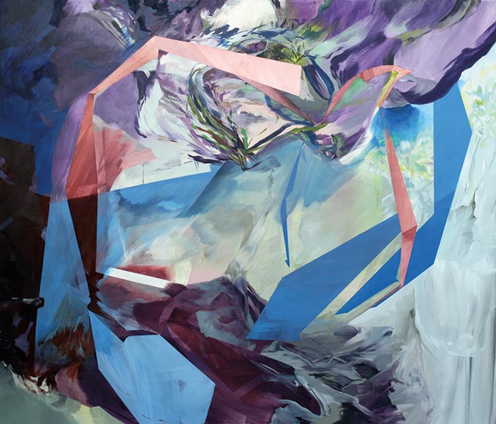
What is interesting about the work of Montreal-born, Ottawa-based Melanie Authier is how, within abstraction, she invokes deeply illusionistic space by working with a variegated, sophisticated palette that avoids falling into ruts. At no point is she tricking us. She clearly loves paint as paint. Many critics have noted that the scenes in her works have a landscape quality, but there is also a feeling of complex, architectonic space. The sharp edges, twisting ribbons, and implied planes suggest the shattered geometries of both cubism and the architecture of Zaha Hadid. Authier plays free jazz, and like Max Ernst or Cy Twombly she proves that in the right hands the investigation of materials and form can yield fascinating results. We can look at her work, become lost in her argument, and forget our aching legs.

This gallery of Canadian contemporary art is proudly supported by TD Bank Group.
This appeared in the December 2013 issue.