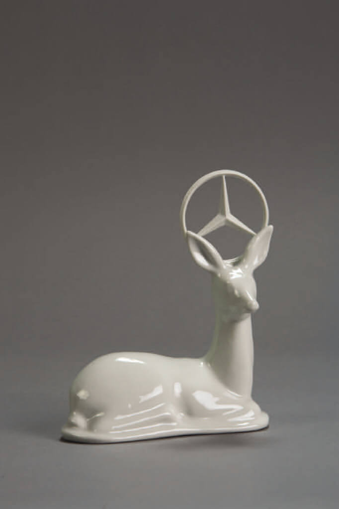
The polar bear, the deer, the Inuit—these Canadian icons were all on the table when designer Cynthia Hathaway introduced a collection of porcelain figurines at Toronto’s Gladstone Hotel last year. The forms were immediately familiar, though radically transformed. The bear struggled for its life as it sank into the tabletop, the deer had a Mercedes-Benz logo for a halo, and the good-natured Inuit was melting into a puddle. “They are your standard souvenir forms from the past, but I really wanted to bring attention to what’s happening now in Canadian nature and to the peoples of Canada,” says Hathaway, who named the collection Souvenirs Revisited. “We have the polar bear, but it’s starving to death in the Arctic. The deer is about our consumption and branding of nature.”
Hathaway is one of the leading figures in a new wave of Canadian designers who are taking the profession places it hasn’t been before. Although designers in other countries have long had signature styles—Italy is known for its flamboyant furniture, Japan is pegged to clean minimalism, and Scandinavia is famous for sensuous bentwood creations—Canadian designers have never developed a look or philosophy they could call their own. But that’s changing. Over the past few years, designers across the country have been taking on Canadian icons and images, transforming them into a style that might best be described as “lumberjack chic.” Prominently featuring wildlife, camping gear, and unadulterated Canadian wilderness, the aesthetic doesn’t so much reflect modern Canadian culture as it does other people’s expectations of what it means to be Canadian.
The movement began in 2003 with the Cabin project, a travelling exhibition organized by Motherbrand, a company founded by Canadian designers Michael Erdmann and Todd Falkowsky. Erdmann and Falkowsky both attended architecture school in the Netherlands, which gave them an outside perspective that led to an interesting observation: there were lots of great Canadian designers, but almost all of them had left the country. “We kept running into more and more Canadians who were doing great work outside of Canada,” says Falkowsky, “like Eugene Wang, who was a designer at Apple. They had the platforms to be designers in a bigger way.” Indeed, Canada’s best-known industrial designer, Karim Rashid, is actually based in New York. His popular products, such as the Kone hand-held vacuum for Dirt Devil, have appealing shapes but give little sense of place—they could have been developed anywhere. Until recently, most contemporary Canadian designers sought to follow in those footsteps, even while designers in other countries turned out products that clearly grew out of regional traditions.
Hoping to add a more Canadian edge to Canadian design, Erdmann and Falkowsky asked designers based both at home and abroad to reimagine objects one might find in a cabin. The results included a chair with Hudson’s Bay Company point blanket upholstery; woodsy wallpaper with silhouettes of Mounties and assorted Canadiana; and a faux-bloodstained bearskin rug. Exhibited in New York during the International Contemporary Furniture Fair (ICFF) in 2004, the Cabin show was a smash success. It received equally positive receptions in Tokyo and London.
“That’s a very self-conscious reflection on a more rural, wilderness-oriented society,” says Ellen Lupton, curator of contemporary design at the Cooper-Hewitt National Design Museum in New York, which later acquired the wallpaper for its permanent collection (the product, named Memory Wallpaper, was designed by Hathaway). “But presenting the cabin in the context of the ICFF obviously engages a global design dialogue. So even while designers want to articulate a regional aesthetic and camaraderie, there’s also an interest in being part of the scene, and part of the world conversation.”
The only mixed reviews came once the exhibit returned to Toronto. “The Canadian press was really gun shy about the project, because it was seen as navel gazing and rehashing the Canadian myth,” says Falkowsky, who is also a professor at the Ontario College of Art & Design. “The reality is that that kind of navel gazing really hadn’t ever happened in Canadian design before.” One explanation for the cooler reviews may be a general perception among Canadian audiences that their own icons and symbols aren’t sophisticated enough. “There’s a lack of confidence in the Canadian aesthetic,” says Falkowsky. “For some reason, it feels dusty to designers who want to participate globally. They want to be part of something that’s a global product, but they miss the strategic side: great design has always tapped into its localness, and that localness became the global product. If you look at Italian design, it was that style from Italy that made it so popular globally. Same with Germany, Japan, and especially Holland.”
Regardless of whether the local press celebrated or panned the project, it brought Canadian designers some much-needed attention on the international stage, and many have since run with the aesthetic, channelling everything from Canadian wildlife to Douglas Coupland’s Souvenir of Canada. With its White Moose brand project, Edmonton’s Fat Crow Design is one of the latest groups to grab hold of the trend. Its members, four recent graduates from the University of Alberta, have developed tables modelled on moose legs, ottomans that resemble fishing lures, and light fixtures that look like fallen leaves. “I’m a farm kid from seven hours northwest of Edmonton, in the middle of nowhere,” says the group’s founder, Tyler Vreeling, explaining his decision to eschew futuristic concepts in favour of backwoods style. “My neighbours live in a shop with a dirt floor and no running water.” The name White Moose is also intended to say something about the group’s design intent. “White represents modernism, minimalism, clean, edgy, forward-looking stuff,” says Vreeling. “Moose represents the natural, organic, and very subdued. I tried to combine those two things. I wanted the furniture to reference nature but the materials and forms to be very strong and sharp.”
Winnipeg’s Matthew Kroeker has gained international attention with such products as Saw, a table lamp that looks like a sawhorse and blade. The Loyal Loot Collective, four women from Calgary and Edmonton, has found success with such pieces as Log Bowls, which are carved from sections of tree trunk and lacquered on the inside; as well as the Hung Table, which features a crocheted tabletop with integrated pockets. In Toronto, Castor Canadensis makes heavy-duty outdoor saunas from old shipping containers; limestone stools that look like tree stumps gnawed by beavers; and credenzas latched together with cargo straps. “We enjoy the outdoors, and we grew up with things like the National Film Board’s Hinterland Who’s Who,” says Ryan Taylor, who founded the firm with Brian Richer. “There are funny, interesting things in our pop culture . . . using those things in our work draws people in.” And just in case people don’t pick up on the woodsy workingman references, using the word Castor in the firm’s name makes the Canadian connection clear. “It means ‘beaver’ in both French and Latin,” says Taylor. “And the beaver is just such a funny animal—why the hell wouldn’t you use it in your name? He’s the engineer and architect of the animal world.”
The emerging Canadian aesthetic didn’t just develop in isolation—it was created by designers who were already deeply influenced by Dutch design. Over the past decade, functionality has taken a back seat to whimsy in objects created by designers in the Netherlands. Marcel Wanders, perhaps the most famous of the Dutch designers, has made chairs from hardened crocheted lace; and “snotty” vases, oversized replicas of mucus particles captured mid-sneeze. Canadian designers have taken that same tongue-in-cheek approach, but added their own history to the mix.
In many cases, the Dutch flavour runs even deeper than mere influence. Erdmann and Falkowsky weren’t the only designers to train in the Netherlands; Cynthia Hathaway did, too. “I went to Holland because it afforded a sensibility I appreciated,” she says. “Holland has been very proud and supportive of designers who think for themselves. I think they’re creating a stir in the world.” After finishing her own education, she stayed on as an instructor at the prestigious Design Academy Eindhoven, where she ran the FunLab master’s course from 2002 to 2006. She continues to live in the Netherlands today, yet her work maintains a clear Canadian influence. Canadian icons and symbols are “home turf,” she says. “I feel comfortable with them. I can analyze them quickly and try to transform them, hopefully without cliché.” That approach has made her work accessible to those both inside and outside Canada. “I play with what is recognizable,” she says. “You grab something that is within people’s minds of what Canada is. It’s an interesting way to communicate.” The partners of Castor Canadensis have experienced the same thing. Though they’re based in Toronto and much of their work has a Canadian theme, the majority of their sales are made to buyers in Europe and the United States. “I’d say about 75 percent of our buyers understand the Canadian stuff,” says Taylor. “The rest just enjoy the aesthetic.”
While most of these designers are quick to admit they’ve been influenced by Dutch design, they’re just as quick to suggest they’ve gone beyond mere imitation and are in the process of creating something of their own. Castor Canadensis grew so tired of being compared with the influential Dutch design collective Droog that it named a lamp consisting of truck lights and electric guitar pedals their “This is not a f**king Droog light, light.” “It was a bit of a marketing ploy, but at the same time so many people email us and say, ‘You guys are like the Canadian Droog,’ ” says Taylor. “We love Droog’s work, but there are a lot of people other than Droog doing interesting things.”
One of the side effects of the emergence of this Canadian aesthetic is a new interest in and awareness of Canadian design history. When Fat Crow Design was creating the pieces for its inaugural White Moose collection, it designed a chair with cushions inspired by a space heater. But it was no random space heater—it specifically paid tribute to the Canadian General Electric Teardrop heater, created by Toronto industrial designer Fred Moffatt in 1962. Citing concerns about the availability of information related to Canadian design, Erdmann and Falkowsky have moved on to their next major project—an online database named the Canadian Design Resource, which aims to catalogue and preserve Canadian graphic and industrial design, both by prominent figures and previously unknown designers. “Whenever we googled Canadian design, we could never find anything, so we thought there must be some way to start pushing this work into the Internet and making it accessible,” says Falkowsky. “Now we get email from Austin, Texas, to Germany from people saying, ‘I had no idea there was design in Canada.’ ”
But yes, there is design in Canada. And while the rest of the world might not have been aware of it before, there are legions of Canadian designers practising today who are pushing to make sure their voices are heard. If that means pandering to preconceptions about Canadian life, so be it. In the end, the joke is on the audience, because at the same time that designers are paying tribute to beavers and Mounties, they’re also sending up old-fashioned ideas of what it means to be Canadian. “Using those Canadian symbols is a way to grab people’s attention,” says Hathaway. “But I don’t want to fall into the trap of being nostalgic. I want to bring in a contemporary point of view to what’s happening in the here and now.” Laugh at their woodsy creations if you like, but once you’re done these designers hope you’ll take a closer look at what lies beneath.

Images Courtesy of Die Gestalten Verlag from the book Fragilies: Porcelain, Glass and Ceramics (2008)


