
When Frederik Vanmeert stands in front of a Johannes Vermeer painting, the temptation to go close is irresistible. In Amsterdam’s Rijksmuseum, where he works as a heritage scientist, it’s not hard to satisfy this craving for intimacy; patrons are free to get personal with the art. Viewers of Rembrandt’s The Night Watch can approach within a metre of the canvas, while the museum’s four Vermeers, hanging nearby, offer an even more intimate experience. Viewers may, if the moment moves them, lean in within centimetres, though the security guard posted nearby will likely wag a disapproving finger.
Still, even millimetres are an interminable chasm for Vanmeert. He’s seen Vermeer’s work in finer detail than most—at the microscopic level, down to the crystal latticework of the pigments that structure the language of the seventeenth-century Dutch painter’s artistic vision. “These days, because of my work, when I look at a Vermeer, I can’t help but wonder: Are we really understanding what he intended?” Vanmeert tells me, approaching The Little Street, one of only two landscapes the artist is known to have painted. “I get drawn closer to, say, this area here—the dark area of the lady’s dress. It’s difficult to decipher which type of fabric Vermeer meant to depict here, and I wonder if this is the original colour.”
Fidelity of colour is Vanmeert’s professional obsession. As a chemist in the art world, he’s spent most of his career trying to understand colour: how it is produced, how it changes over time, how artists prepare the powders and substrates that become the medium through which they speak to us, and, ultimately, why they make the choices they do. If colour is the language of art, Vanmeert is its linguist.
As a scientist, though, he avoids such grand pretensions. It’s a touchy subject. The past two decades have seen an explosion of scientific enquiry into art, from chemical analysis for authentication and identifying forgeries to techniques for restoration and conservation. In the process, scientists have found themselves thrust into some of the art world’s most vexing debates, often controversially. Determining what an artist “intended,” for instance, can send art experts and enthusiasts into a tizzy. The artist’s intent is irrelevant, the purists say. Only the work matters, and what the work conveys.
Vanmeert is uninterested in these types of debates. What he means by “intention” is colour: Is the colour, as we see it today, the same colour the artist saw when they applied it to the canvas? And if it has degraded, what would the original have looked like? Vincent van Gogh’s The Bedroom, for instance, used many unstable pigments which degraded over time. Fortunately, in a letter to his brother, van Gogh described in detail the colours he used: “The walls are of a pale violet. The floor—is of red tiles. The bedstead and the chairs are fresh butter yellow.” Today, many of these colours have faded or, in the case of the walls, mutated into a different hue altogether. The colours van Gogh “intended” have been lost and, along with them, something of the feeling van Gogh was attempting to convey.
Vermeer, famously nicknamed the Sphinx of Delft by the nineteenth-century French critic Theophile Thoré-Bürger, left no such known colour recipes behind. Indeed, almost nothing is known about his life or his artistic practice: he did not appear to employ assistants or keep notes and may have had only one student. Historians still debate where he even learned to paint. What can be gleaned, or intimated, about his life and work comes mostly from the limited number of paintings he left behind—thirty-seven in total attributed to him—and the work of scientists like Vanmeert who dive deeply into his material practice in ways connoisseurs and art historians can’t.
Studying Vermeer’s material practice raises some fascinating questions. How did Vermeer achieve the satiny feel of the dress in The Girl with a Wine Glass? Why did he choose to use ultramarine, a fabulously expensive pigment made from lapis lazuli, in the diluted blues of Clio’s laurel wreath in The Art of Painting when other, cheaper materials like azurite or smalt would have sufficed? The answers to those questions can lead to a better understanding of both Vermeer and his art.
Some explanations are tantalizingly close. Vermeer’s liberal use of ultramarine, for instance, may reflect a desire for chromatic fidelity: aside from its price, the pigment is famously stable. Other kinds of blues, deployed liberally by Vermeer’s contemporaries, including Rembrandt, would degrade over time. That may have been fine for Rembrandt, who was as much an entrepreneur as he was a great artist, but for Vermeer, it was likely sacrilege. From what little we know about his relationship to the art world of his time, Vermeer appeared to be uninterested in making art for the art market. Instead, he seemed to make art to satisfy an internal craving, or desire, to express something timeless and have that expression survive the vagaries of time.
The materials, thus, mattered. The challenge in the past has been obtaining enough data. Traditional methods for determining the chemical compositions of pigments required removing a fragment, usually only several hundreds of micrometres across, of a painting, often taken from an already damaged section. The resulting data offered important insights, but they were limited to minuscule sections of a work.
Vanmeert’s approach—Macroscopic X-Ray Powder Diffraction scanning, or MA-XRPD, using a device he developed during his doctoral work at the University of Antwerp—offers a non-invasive means of analyzing artworks at the molecular level. “The MA-XRPD process allows us to scan a large section of the painting, up to thirty by thirty centimetres, without causing any damage,” Vanmeert says. “So we can now see more clearly how an artist is using pigments across whole sections of the work.”
The method’s light touch also means researchers are able to secure permission to view more paintings. For Vanmeert, whose interest lies primarily in Vermeer, that has meant the opportunity to analyze multiple works, nearly half of Vermeer’s ouevre so far, housed in multiple museums around the world, and look for patterns in his use of pigments and other techniques and their development over time. He’s tight lipped about what he’s found but admits there is something. “I still need to go through a lot of data to confirm my hypothesis,” he says, a broad smile betraying his excitement.

Previously published results suggest the new discoveries could very well shift our thinking about Vermeer in profound ways. In 2019, Vanmeert and a team of scientists from two Dutch universities, in collaboration with the Mauritshuis museum and the National Gallery of Art, embarked on a research project using the MA-XRPD method to gain a better understanding of the lead whites Vermeer used in his best-known work, Girl with a Pearl Earring. Experts had known for some time that Vermeer used lead white in his paintings, as did most artists of his time, but studies up to that point had been able to analyze only very small sections of the painting.
“Using the MA-XRPD method, we were able to do a comparative analysis of different parts of the painting,” he says. “We could then see the differences within the types of lead white being used and that these differences were meaningful for Vermeer. There was a purpose to it.”
The resulting paper, with its painfully clinical title, “Macroscopic x-ray powder diffraction imaging reveals Vermeer’s discriminating use of lead white pigments in Girl with a Pearl Earring,” is a fascinating exploration of Vermeer’s artistic process. Vanmeert and his team found two types of lead white pigment throughout Girl with a Pearl Earring. The predominant type was comprised of a crystalline lead carbonate called hydrocerussite. It was found in the highlights in the girl’s face, headdress, and collar, as well as in the base layers of the painting, where it was mixed with chalk.
Hydrocerussite, which made up the most common commercially available lead white pigment in seventeenth-century Delft, has relatively large hexagonal crystals that, Vanmeert tells me, align well when applied to the canvas. “This is key to Vermeer’s highlights,” he says. “Depending on how big the crystals are, and how nicely they align on the surface of the painting, they can reflect more light to provide a more vivid white.”
Vermeer, of course, could not have known this level of detail about hydrocerussite crystals. He also did not know that if you grind and wash hydrocerussite, you can produce another lead carbonate called cerussite. What Vermeer likely did know was that this form of lead white produces a finer, more translucent paint. He used this in the penumbral transitions between light and shadow.
Jason Logan, the Toronto-based designer and ink maker who was the subject of the award-winning documentary The Colour of Ink, thinks producing such effects was, more than the longevity of any specific pigment, what probably drove Vermeer. “I’ve met a lot of pigment obsessives,” he says. Some may want their work to last a thousand years, but many “really get into the process, and it becomes this obsession.”
Vermeer’s obsession extended to his subject matter too. His oeuvre consists almost exclusively of paintings of his hometown, Delft, and mostly indoor scenes of everyday life. It’s possible, then, that beyond their chemical durability, Vermeer’s careful attention to the preparation of his pigments was intended to render this personal world with a high degree of textural accuracy. As a painter of the prosaic, Vermeer seemed preoccupied with the visceral effects of the material world around him and how to transfer those immanent qualities onto the canvas.
In that sense, the materials also mattered.
Obsessiveness is something Vanmeert can appreciate: he, too, swims in a sea of details and minutiae and embraces the time it takes to find just the right combination to produce meaning. Vermeer’s artistic practice is the appropriate blend of technical prowess and patience to pique his interest. The time it took Vermeer to complete his paintings—often years for canvases measuring less than a square metre—is only one part of it. He also did it with an extremely limited palette, a mere twenty or so colours.
The limited palette is intriguing. Vermeer’s ability to produce works of such astonishing beauty with so few colours is remarkable. But if you look as closely as Vanmeert does, you see something else too: colour is meticulously prepared; paints are carefully layered, one on top of the other, to produce delicate highlights, suggestive shadows, and textures that project an almost tactile quality. At the microscopic level, what you see is that Vermeer is not only transferring his vision onto the canvas; he is doing it in painstaking detail, sometimes with such an obsessive attention to material that it feels like a kind of madness.
Logan sees this slow, obsessive work ethic as something approaching the poetic. “This stuff takes time,” he tells me. “Some people might question the point of it all. They’ll be like, well, I can’t see any difference. But for the artist, there is a difference. There’s something beautiful in the almost invisible work. The magic lives one level below the recognizable.”
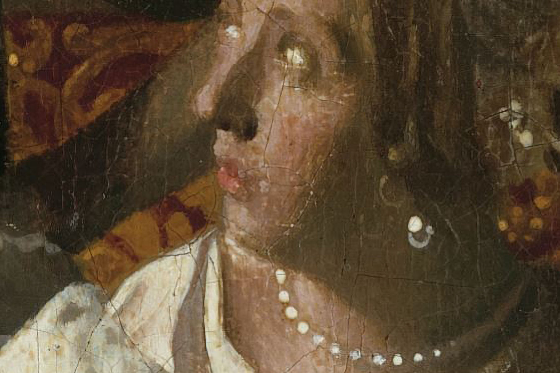
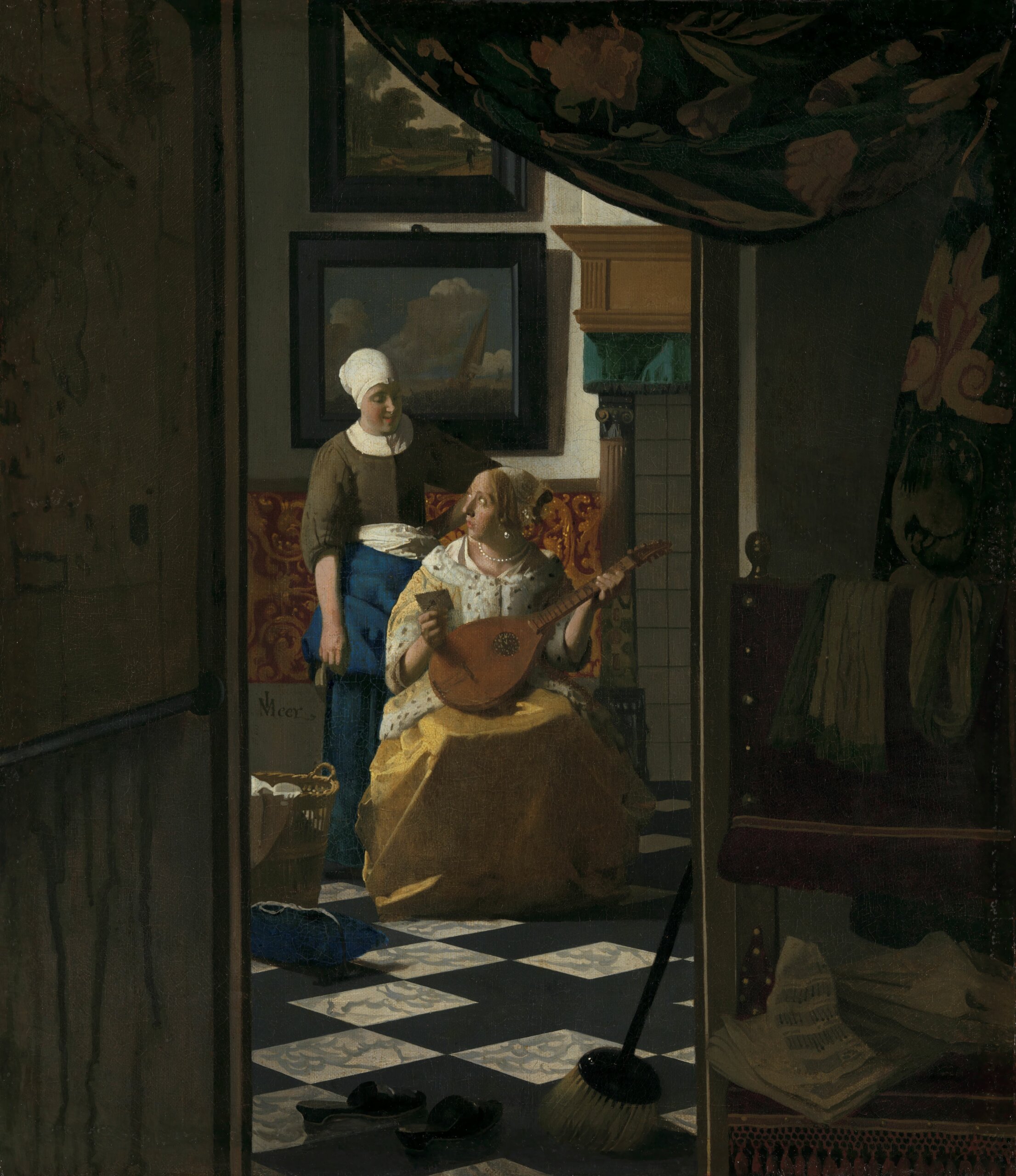
Is Vanmeert, then, exposing Vermeer’s magic? He doesn’t think so. If colour was meaning for Vermeer, the chemist’s work is to clarify Vermeer’s message. When in his later paintings he began using green earth pigment prominently in the shadowed skin tones, what was he trying to express? “It doesn’t look very natural,” Vanmeert says, pointing to the greenish hues in The Love Letter, one of Vermeer’s last paintings before his untimely death, in 1675, “so why did he use it there? Is that the original colour, or has part of the colour degraded away and we are now only seeing the green leftovers? Are we only seeing the remnant of what he meant, or was this colour the meaning?”
If we are to believe Philip Ball, the author of Bright Earth: Art and the Invention of Color, answering such questions is crucial to understanding Vermeer as well as other artists of his period. Painters in the Renaissance “were deeply engaged with their materials,” he said during a 2014 lecture at Bristol University. “Few contemporary artists have a comparable relationship with the physical nature, the characteristics, of the medium that they use.”
Today, in our ready-made world, most artists use off-the-shelf paints for their work, Ball added. But for Vermeer, pigments were the grammar of his artistic language. The stability of those materials allows us to remain in conversation with him. The language of his colours remains the language he was speaking 350-plus years ago, unadulterated by time. We’ll never know if that was, in fact, what Vermeer intended, but I like to think he’s still speaking to us, imploring us to slow down, to come close and look at the world in all its minute glory, to feel its colours and its textures. “The world is precious, and it is fragile,” Vermeer seems to say. “Cherish it.”